The Pinto Commission
One of the jobs I worked on last year was for a friend’s cafe. I was commissioned to design a pattern which they could use for their business; something which would work with their existing logo and complement the aesthetics of the cafe and its surroundings. The cafe itself, Pinto Coffee+, is a charming and rustic place situated on a small hill in Kampung Janda Baik, just 40 minutes from Kuala Lumpur. Built almost entirely of wood, Pinto blends beautifully with the tall trees and lush tropical greenery that surround it, while its open-air concept allows the cool breeze to flow through even on the hottest of days. Having coffee at Pinto is a great way to escape the hustle and bustle of the city, and just unwind in nature. They also grow their own coffee and roast the beans onsite - which adds to the cafe’s charm.
For this commission, I wanted my designs to reflect not just the visual aspects of Pinto, but also how it feels when you’re there. I imagined the rustling of leaves, the chirping of birds and insects in the forest, and sunlight streaming through the branches. I imagined the smell of coffee and thought about the colour palette: lots of rich, velvety greens, some mottled with brown, and the vibrant vermillions, oranges, and fuschias of jungle flora.
I decided to paint the motifs in watercolour. I wanted the vibrant colours that the medium offers, but more than that, I wanted the granulation and gradation of colours - my favourite characteristics of watercolour. I ended up designing twelve patterns for the client to choose from: ten patterns housed within two collections, and two standalone patterns. All save one began their lives as brush strokes on paper, then scanned and transformed into patterns in Photoshop. The one remaining pattern was done entirely digitally - initially in Procreate using a “watercolour” brush, then in Photoshop.
Over a series of blog posts I will write about all these designs, but today we begin with the first collection, Rainforest Rambling.
Rainforest Rambling: a mini collection
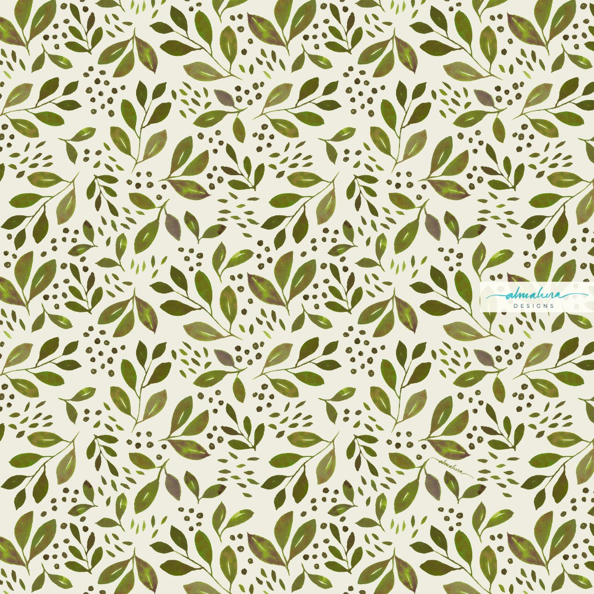
This mini-collection is made up of three seamless repeat patterns, and was inspired by long, meditative walks in the forest. The namesake pattern in this collection, Rainforest Rambling, is my interpretation of what you’d see were you surrounded by trees and looked up to the sky: a canopy of leaves and branches punctuated by rays of sunlight.
Rainforest Rambling
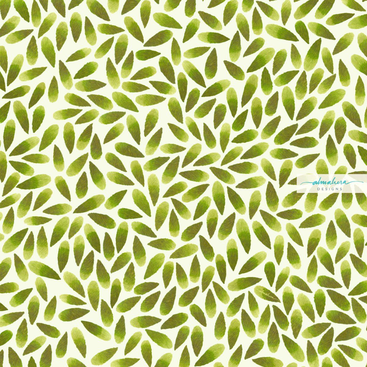
Breeze I and Breeze II, the other two patterns in the collection, remind me of small leaves swept off the ground by a gust of wind, dancing in the air.
Breeze I
Breeze II
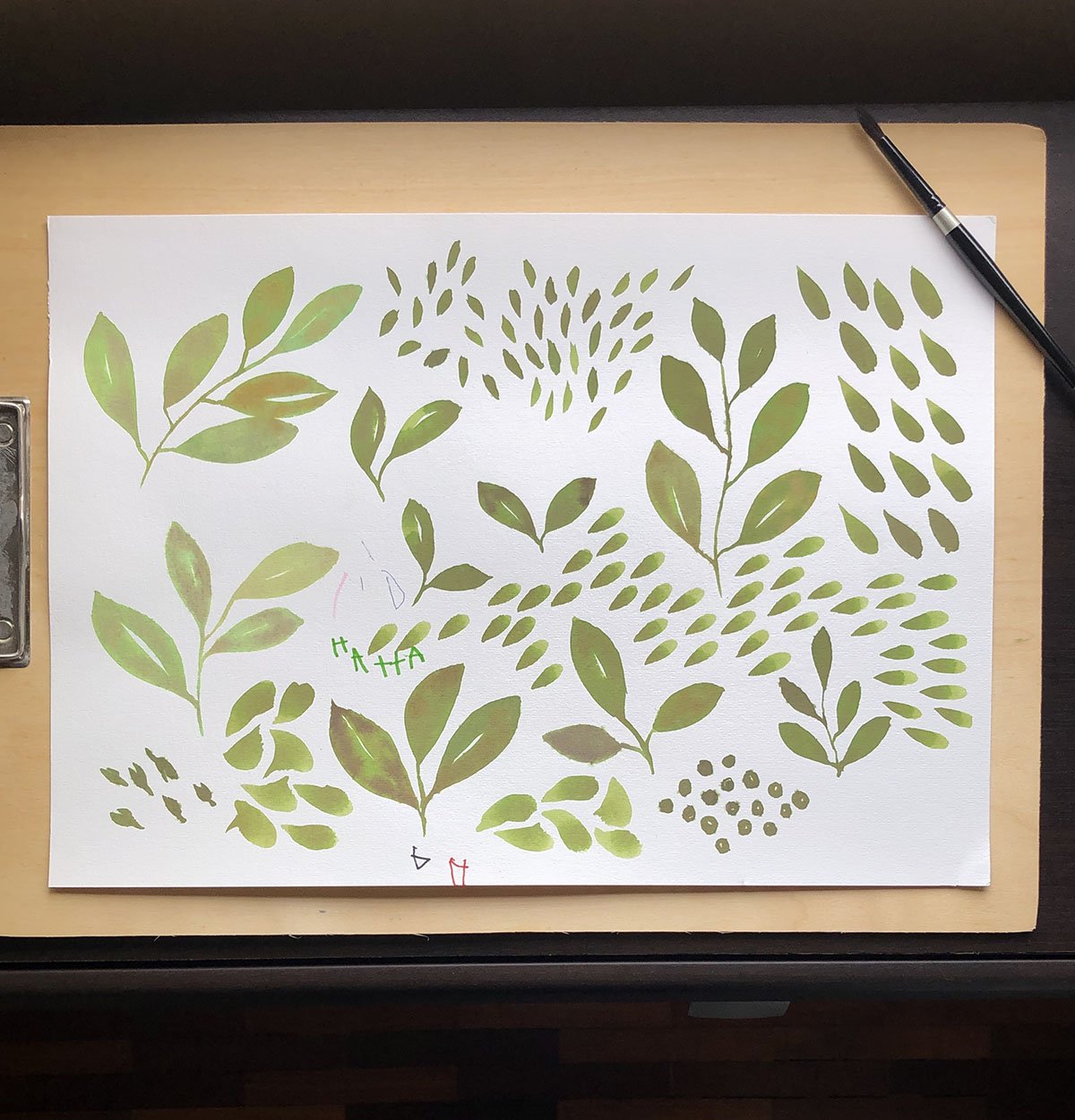
If my memory serves me right, I used liquid watercolours to paint the motifs (I really need be more conscientious with my behind-the-scenes/process photos). I scanned them in as usual once it was dry, and just in time, too - before my son decided to sign it off in his name.
Before the pattern - the motifs painted in watercolour.
The two Breeze patterns were an exercise in patience to make, but oddly therapeutic. It was essentially just placing and arranging each and every teardrop-shaped “leaf” on the art board, rotating each one a tiny bit to the left or all the way to the right to make sure it fits perfectly, while trying to make it looked somewhat “random”. I was using a 15”x15” art board, and each motif was about 1.5” long. So there were a lot of leaves to arrange on that board. When I was about 10% in, I thought to myself, “Ok this is ridiculous. It’ll take forever and a year to finish this. Whose brilliant idea was this?!?”
Mine. It was my brilliant idea. No one else to blame but me.
A peek into my working files. All those “leaves” (petals?) were arranged, one by one, on the art board.
So I abandoned it, and decided to start working on some other design options for Pinto. Which I did, and then I revisited Breeze. The second time around it didn’t feel as Sisyphean a task as it did before; the pattern was developing slowly and I could see the end. I actually enjoyed the process - so much so that after completing it, I decided to make a second version: Breeze II, which has more negative space and therefore feels “lighter”.
I’m actually glad I went back to finish it; the pattern doesn’t look half bad in my opinion, and based on the mockups I prepared, would actually work pretty decently on products.
Some product mockups using the Rainforest Rambling pattern.
More mockup fun!
Huh. I’ve just realised, after writing this, the irony of the name. Breeze I and Breeze II, were not by any measure, a breeze to make.
That’s all for now. Until next time, toodles!
-A-


