Rainforest Rambling

The Pinto Commission

One of the jobs I worked on last year was for a friend’s cafe. I was commissioned to design a pattern which they could use for their business; something which would work with their existing logo and complement the aesthetics of the cafe and its surroundings. The cafe itself, Pinto Coffee+, is a charming and rustic place situated on a small hill in Kampung Janda Baik, just 40 minutes from Kuala Lumpur. Built almost entirely of wood, Pinto blends beautifully with the tall trees and lush tropical greenery that surround it, while its open-air concept allows the cool breeze to flow through even on the hottest of days. Having coffee at Pinto is a great way to escape the hustle and bustle of the city, and just unwind in nature. They also grow their own coffee and roast the beans onsite - which adds to the cafe’s charm.

For this commission, I wanted my designs to reflect not just the visual aspects of Pinto, but also how it feels when you’re there. I imagined the rustling of leaves, the chirping of birds and insects in the forest, and sunlight streaming through the branches. I imagined the smell of coffee and thought about the colour palette: lots of rich, velvety greens, some mottled with brown, and the vibrant vermillions, oranges, and fuschias of jungle flora.

I decided to paint the motifs in watercolour. I wanted the vibrant colours that the medium offers, but more than that, I wanted the granulation and gradation of colours - my favourite characteristics of watercolour. I ended up designing twelve patterns for the client to choose from: ten patterns housed within two collections, and two standalone patterns. All save one began their lives as brush strokes on paper, then scanned and transformed into patterns in Photoshop. The one remaining pattern was done entirely digitally - initially in Procreate using a “watercolour” brush, then in Photoshop.

Over a series of blog posts I will write about all these designs, but today we begin with the first collection, Rainforest Rambling.

Rainforest Rambling: a mini collection

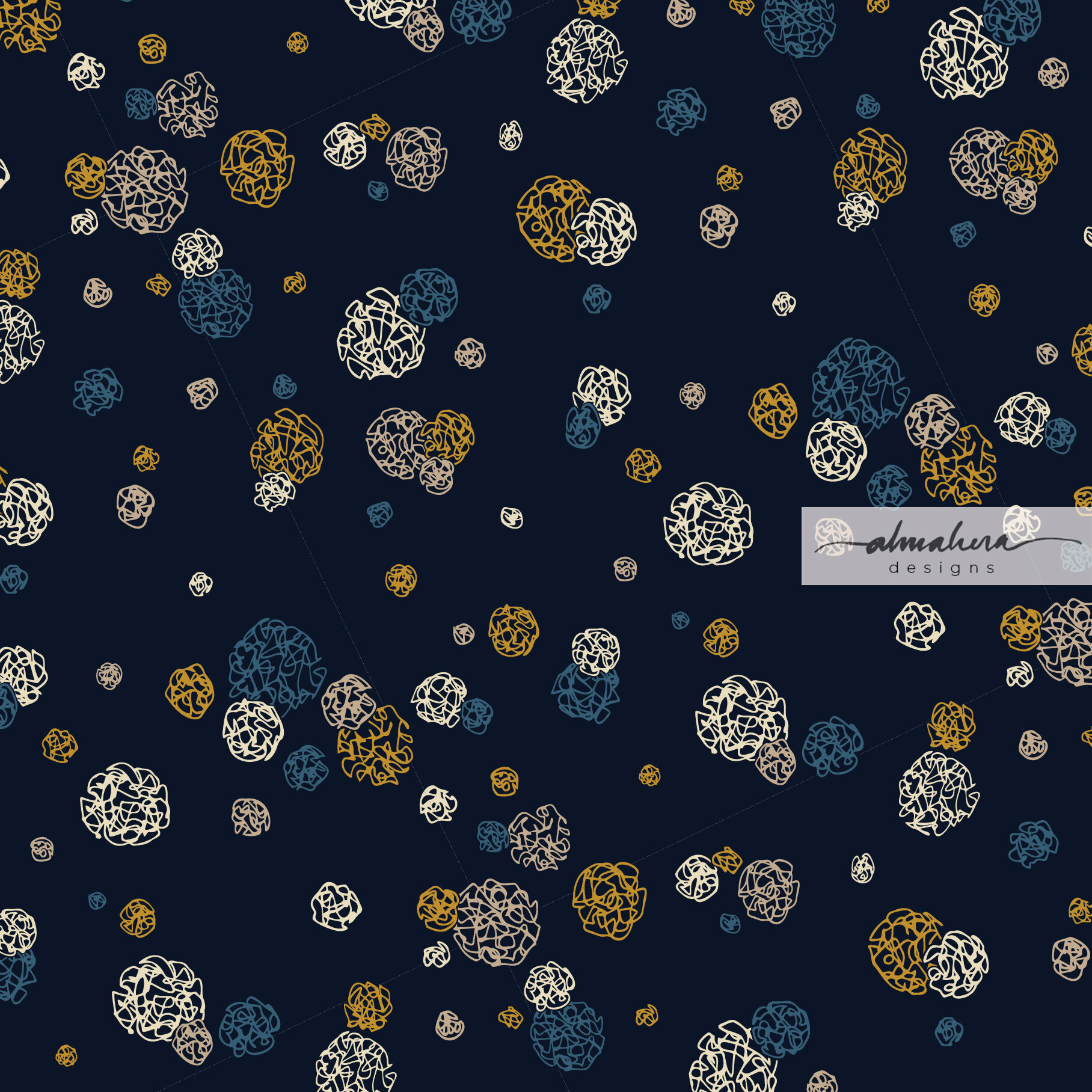
This mini-collection is made up of three seamless repeat patterns, and was inspired by long, meditative walks in the forest. The namesake pattern in this collection, Rainforest Rambling, is my interpretation of what you’d see were you surrounded by trees and looked up to the sky: a canopy of leaves and branches punctuated by rays of sunlight.
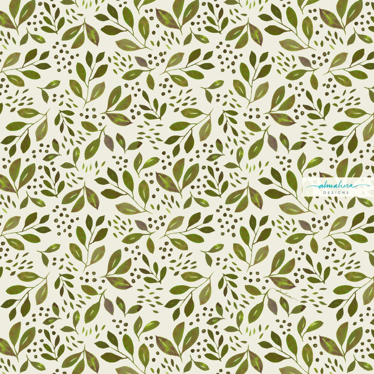
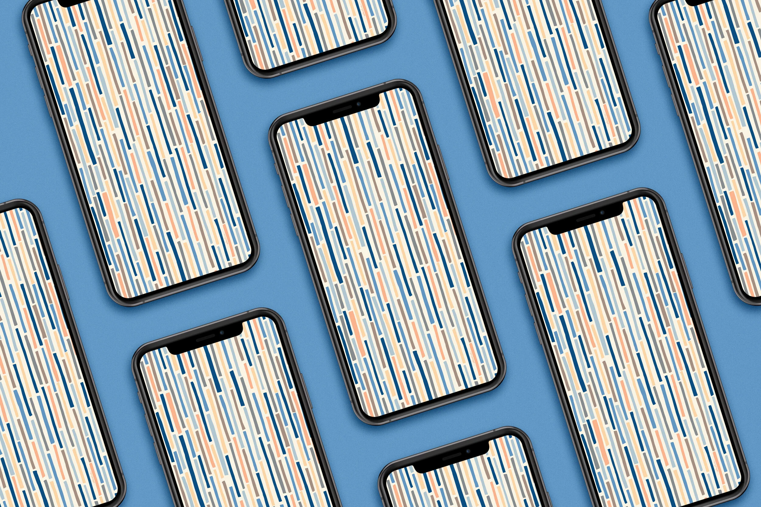
Rainforest Rambling

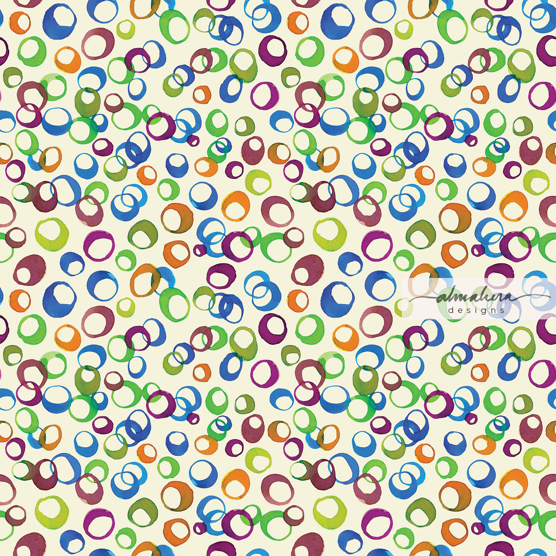
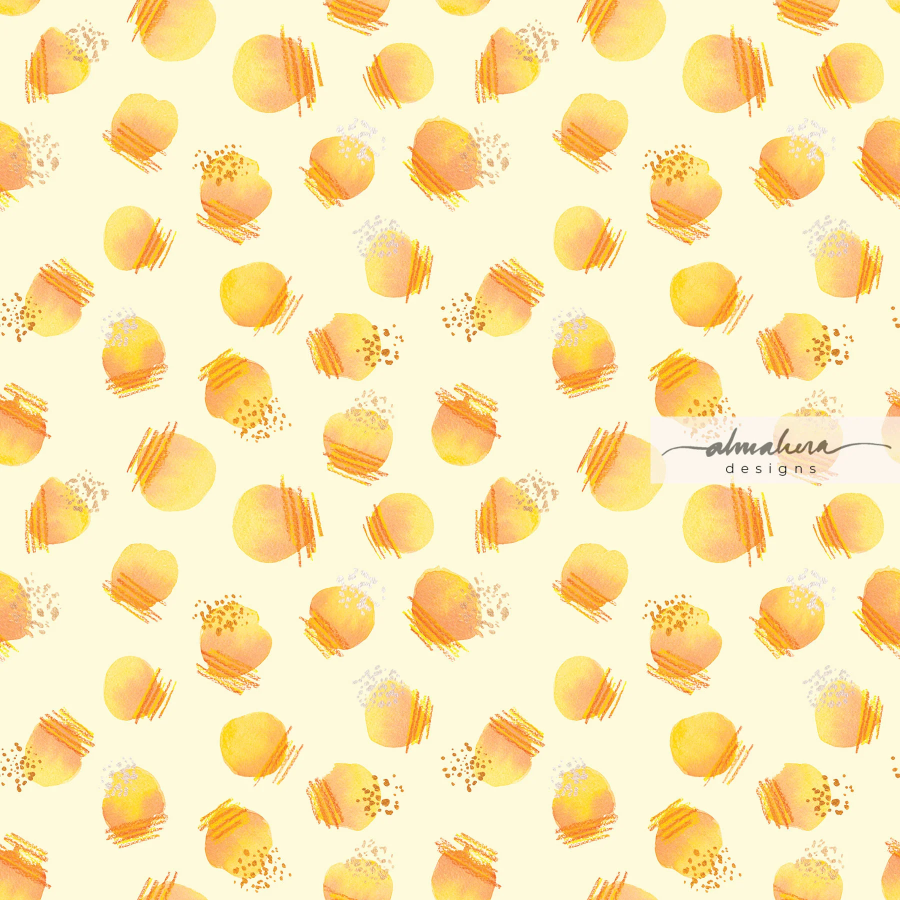
Breeze I and Breeze II, the other two patterns in the collection, remind me of small leaves swept off the ground by a gust of wind, dancing in the air.
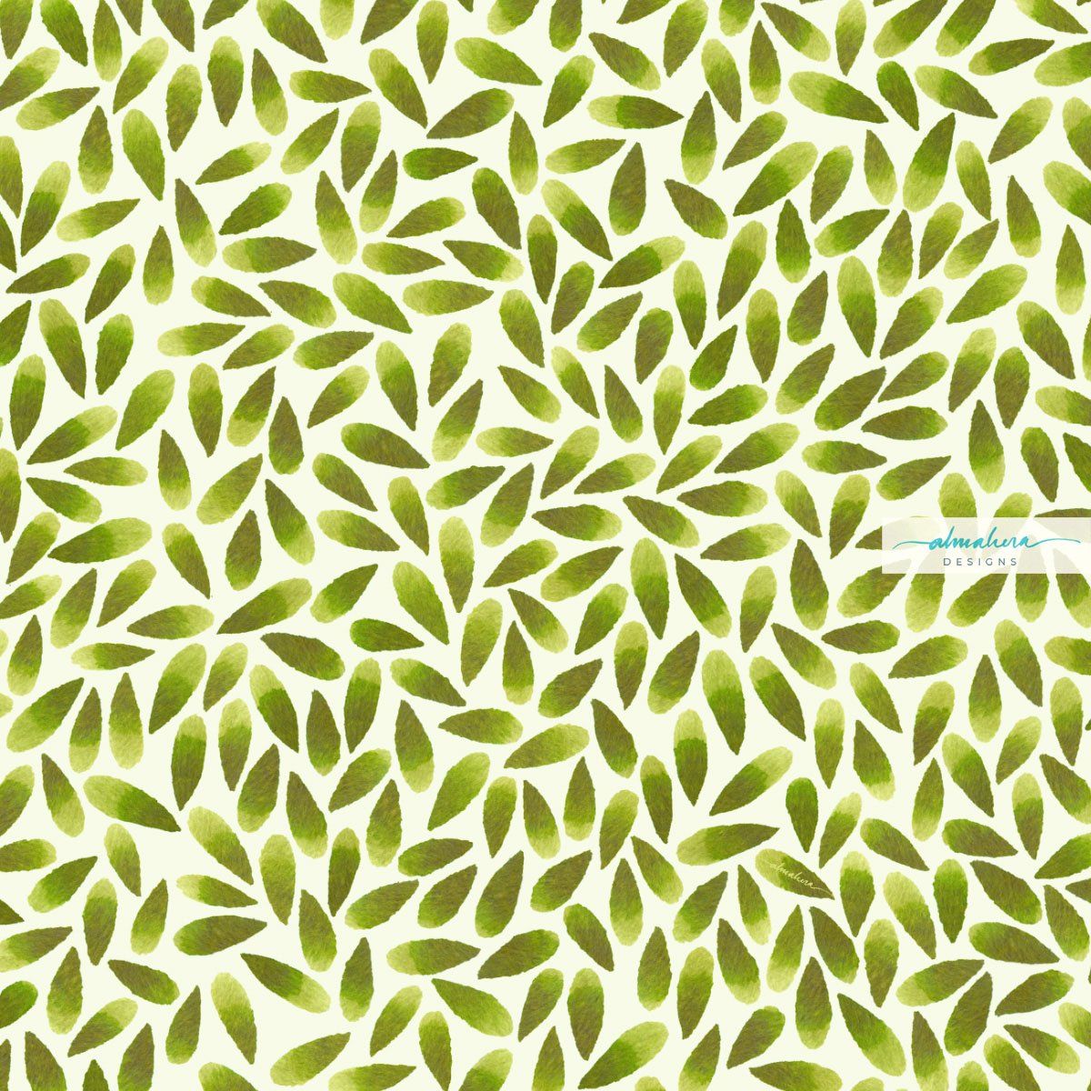
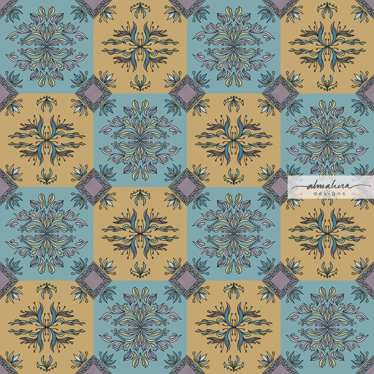
Breeze I

Breeze II

If my memory serves me right, I used liquid watercolours to paint the motifs (I really need be more conscientious with my behind-the-scenes/process photos). I scanned them in as usual once it was dry, and just in time, too - before my son decided to sign it off in his name.

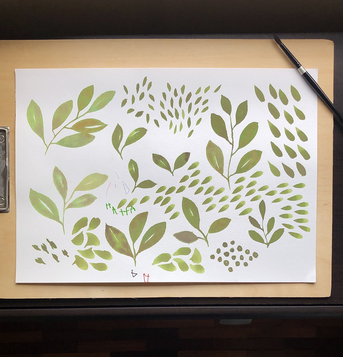
Before the pattern - the motifs painted in watercolour.

The two Breeze patterns were an exercise in patience to make, but oddly therapeutic. It was essentially just placing and arranging each and every teardrop-shaped “leaf” on the art board, rotating each one a tiny bit to the left or all the way to the right to make sure it fits perfectly, while trying to make it looked somewhat “random”. I was using a 15”x15” art board, and each motif was about 1.5” long. So there were a lot of leaves to arrange on that board. When I was about 10% in, I thought to myself, “Ok this is ridiculous. It’ll take forever and a year to finish this. Whose brilliant idea was this?!?”

Mine. It was my brilliant idea. No one else to blame but me.

A peek into my working files. All those “leaves” (petals?) were arranged, one by one, on the art board.

So I abandoned it, and decided to start working on some other design options for Pinto. Which I did, and then I revisited Breeze. The second time around it didn’t feel as Sisyphean a task as it did before; the pattern was developing slowly and I could see the end. I actually enjoyed the process - so much so that after completing it, I decided to make a second version: Breeze II, which has more negative space and therefore feels “lighter”.

I’m actually glad I went back to finish it; the pattern doesn’t look half bad in my opinion, and based on the mockups I prepared, would actually work pretty decently on products.

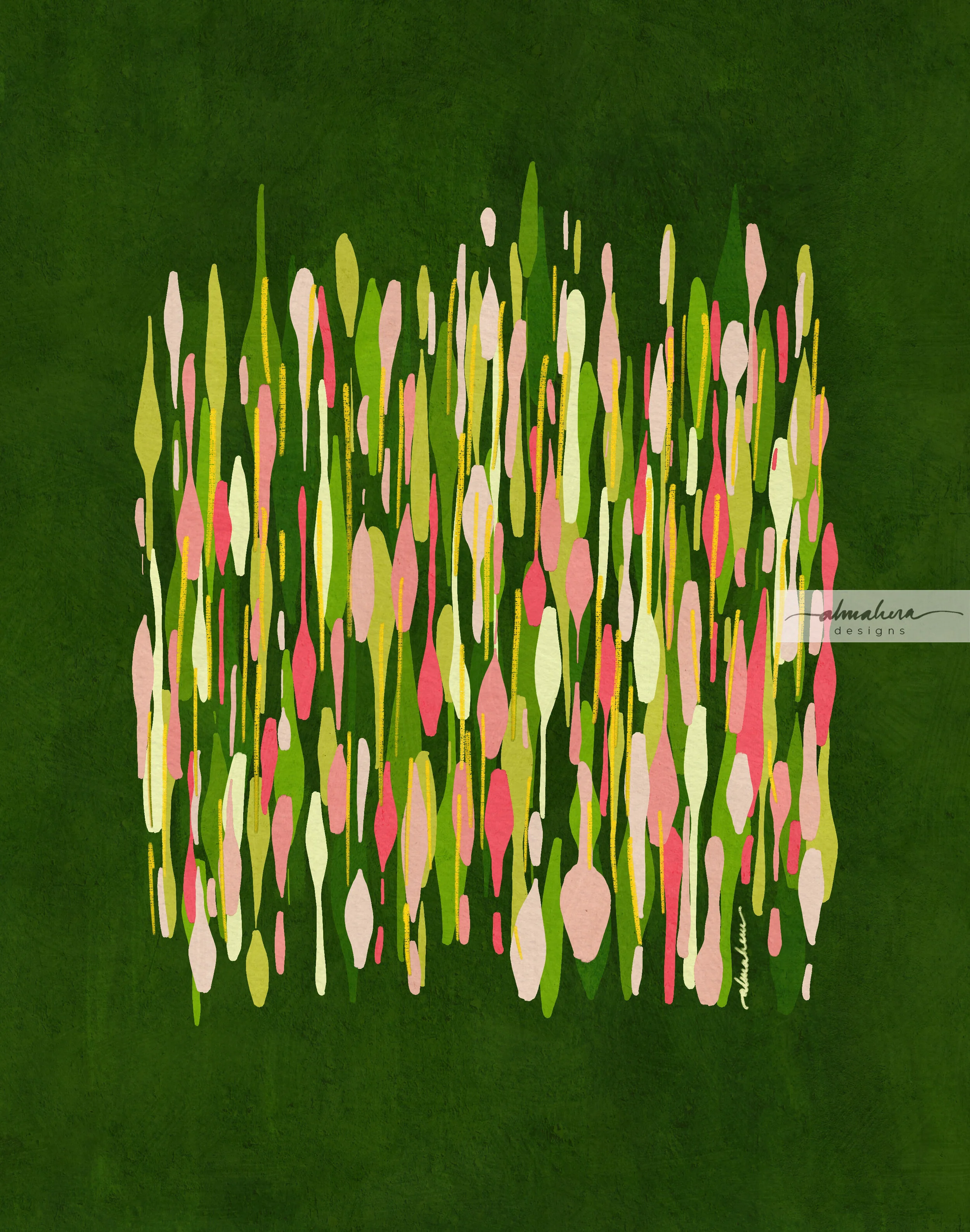
Some product mockups using the Rainforest Rambling pattern.

More mockup fun!

Huh. I’ve just realised, after writing this, the irony of the name. Breeze I and Breeze II, were not by any measure, a breeze to make.

That’s all for now. Until next time, toodles!

-A-

Wallpaper Wednesday: Scallops 3

Hi there! Can you believe it’s August? Already?!?

In all honesty, we’ve been in lockdown/MCO/FMCO/Phase 1/call-it-what-you-want-a-lockdown-by-any-other-name-feels-just-as-stifling for so long now, it feels like Groundhog Day. One sunrise is no different from the next, and the only reason I’m still able to keep track of the days is my son’s e-learning schedule, and the laundry schedule.

Sigh.

But hey - a new month means new wallpaper! At least there’s a little something to brighten up your day, no?

Scallops 3 wallpaper

Scallops 3 wallpaper

Scallops 3 wallpaper

Scallops 3 wallpaper

Scallops 3 wallpaper

Scallops 3 wallpaper

I’m still in the mood for geometric patterns with a bit of an Art Deco vibe. There’s something about these scallop patterns that I find so pleasing… maybe it’s because they’re an iteration of the basic circle, and my default doodling shape is circles? I dunno, I just like these types of patterns, for some reason.

And I hope you do, too!

-A-

As always, these are for personal use only.


Scallops 3

Mobile: iPhone // Android

iPad: Pro 11” // Pro 12.9” // Others

Laptop: MacBook Pro 13” // MacBook Pro 13” with calendar // MacBook Pro 15” // MacBook Pro 15” with calendar

Desktop: iMac 27” // iMac 27” with calendar 

The Akar Dani Series

There's a house somewhere in our neighbourhood that used to have a beautifully lush Akar Dani plant cascading over their back wall. I used to walk past it in the mornings, and every time I did, I felt happy. The vibrant fuschia and pale pink colours of the flowers lifted my spirits, and it inspired me to create the Akar Dani series, a collection of abstract pieces centred around the colour palette of the Akar Dani flowers; a range of vibrant pinks and deep emerald greens. 

Akar Dani flowers

Akar Dani flowers

It was also an opportunity for me to play around with a newly acquired set of Procreate gouache brushes from one of my favourite illustrators, Lisa Glanz. 

"Brush Strokes #1" - The first piece in the series. If the heavens cracked open and rained Akar Dani flowers, this is how I imagine it would look like. 

“Brush Strokes #1”

“Brush Strokes #1”

"Brush Strokes #2" - A variation on the same theme, but I wanted it to look a bit more gloopy and drippy; a bit like raindrops racing down a window pane. 

“Brush Strokes #2”

“Brush Strokes #2”

"Stripes" - Like a lot of people, I love me some good stripes! I initially painted stripes of equal width, thinking that the colours would be enough to lend it character. It still felt boring, though, and I started playing around with different widths until I decided to just let the lines go all over the place, and create wonky, lopsided stripes. I added random textures and patterns here and there - I wanted it to be a fun piece; something chaotic and colourful, something that would brighten up your mood. 

“Stripes”

“Stripes”

"Fish/Lilypads" - I enjoyed making "Brush Strokes #2" and I wanted to create another piece in the same vein, but one that felt a bit calmer and more deliberate. As I was painting this, I thought it looked like a school of (green) fish swimming through the (green) ocean, and went along with that image in my mind. After it was completed though, it looked more like lily pads. 

“Fish/Lilypads”

“Fish/Lilypads”

"Sidewalk" - By this time I was done playing around with random brush strokes, but I was still obsessed with the Akar Dani colour palette. I wanted to create something slightly more “structured”, but still organic and abstract. I was inspired by the pavement tiles near the neighbourhood shops. Like “Stripes”, this piece started out somewhat geometrically correct, but morphed into organic shapes and a riot of colours and patterns. 

“Sidewalk”

"Sidewalk" was supposed to be the last piece in this series… until one morning, I noticed a blank white wall where the luscious Akar Dani plant used to be. The owners of the house had pruned it, cut it down, with nary a trace to be seen or found. I was sad to see it gone; it used to brighten up my mornings so. I decided then that I needed to create another piece, one that actually featured the flower in some form. For some reason I wanted it to be a repeat pattern. The result was not one - but two patterns in a Damask style. I couldn’t decide between the two, so I kept both, and named them, imaginatively, “Akar Dani I”, and “Akar Dani II”

“Akar Dani I”

“Akar Dani I”

“Akar Dani II”

“Akar Dani II”

Unlike “Sidewalk”, these two patterns were really the final pieces in the series. I’d had my fun with the theme, and it was time for me to move on and explore other themes, other colours, and other tools. Once this lockdown is lifted and more businesses are allowed to operate again, I’d like to make these into art prints - I think they’d look nice. 

Until next time, stay safe! 

-A-

Wallpaper Wednesday: Scallops 2

It’s time for new wallpaper! 😄

This month, I chose one of my favourites from a collection of geometric patterns I designed a few weeks ago. I’d just finished a Skillshare tutorial on creating geometric patterns on Procreate and boy, was I hooked! Designing geometric patterns can be addictive - playing with shapes and different permuations, different colour combinations - I was creating one pattern after another for days on end until it got a bit too much… random patterns were popping up in my mind’s eye as I drifted off to sleep, or first thing in the morning, and even in the shower!

Scallops 2. Check out the texture on this!

Scallops 2. Check out the texture on this!

This particular pattern has a bit of an Art Deco/1950’s hybrid feel to it, in my personal opinion. The motif in this pattern is one commonly found in many Art Deco or Art Deco-inspired patterns, and in my case it was totally unintentional. I was just playing around with circles; cropping, flipping, and arranging them in a tile. The colour palette, however, is what gives it its ‘50s/’60s vibe, and that was intentional - if not fully, then at least at a subconscious level. At the time I started getting into geometric patterns, I’d just finished binge-watching The Queen’s Gambit on Netflix (late to the party as always).

I was transfixed.

Apart from the brilliant storyline and performance by the cast, I simply loved the aesthetic. The fashion of that era - the silhouettes, the hairstyles, the colour palette… and the patterns. Glorious, beautiful geometric patterns everywhere. The wallpaper, the textiles, the upholstery - everything. It was a feast for the eyes and I absolutely loved it.

Huh. Thinking back, maybe I started creating geometric patterns because of The Queen’s Gambit. It inspired me to search for geometric pattern tutorials instead of kindling a love for chess 🤓.

In any case, I hope you like this month’s freebie wallpaper. I had a lot of fun creating it, and I think it’ll give your devices a nice retro vibe.

-A-

*As always, these are for personal use only.

Scallops 2

Mobile: iPhone // Android

iPad: Pro 11” // Pro 12.9” // Others

Laptop: MacBook Pro 13” // MacBook Pro 13” with calendar // MacBook Pro 15” // MacBook Pro 15” with calendar

Desktop: iMac 27” // iMac 27” with calendar 

Wallpaper Wednesday: Dokoh

Hi there! Hope you’re staying safe. If you’re fasting, I hope you’ve had a blessed Ramadhan so far. We have about a week to go, and I suppose some of you have started making MCO Raya preparations. All the best!

I wanted to make this month’s wallpaper Raya-appropriate, without resorting to the typical images of ketupat, pelita, or moonlit skies. Don’t get me wrong - I have absolutely nothing against a bunch of ketupat hanging in the upper corner of a poster, or glowing oil lamps set against a dark, moonlit sky; I just didn’t feel like creating a pattern using those motifs.

And yes, I go through moods. Sometimes I feel like playing with watercolours. I love going through my paints and picking them out, experimenting with different brushes, and just watching the colours mix together on paper. I appreciate giving up control over the way the paints move, and letting them do their own thing. In some cases, I add details and highlights in India ink, or white acrylic ink, and when I’m feeling blingy, I add metallic gold ink details.

I even enjoy the steps after I’m done painting, ie scanning, cleaning up, and editing the artwork in Photoshop. There is a part of me that finds certain repetitive and/or operational tasks almost therapeutic. If I had to choose a household chore to do, it would be ironing. I could zone out while listening to a podcast or an audiobook. Similarly with editing digital scans of my artwork, I would zone out while zooming right into all the details, isolating the paper background, and tweaking the contrast and saturation to just the right level, with something playing in the background. And maybe a sweet smelling candle burning.

Sometimes I still feel like creating pattern motifs on paper, but I want to use Illustrator instead of Photoshop in the editing and pattern making steps. So then I wouldn’t paint, but I’d sketch (to the best of my ability) or doodle in ink. I’d choose colour palettes from images I see in magazines or things around me, import them into Illustrator, and click click Pen Tool Blob Brush Space Bar Command, I’m in the zone.

And then there are times when I just want to do it all digitally. No paint, no paper, no brush pen pencil nothing. Just my Procreate and me, doodling away with a tap tap erase and pinch pinch zoom.

By the way, I have a four-and-a-half-year old toddler who spends every waking hour talk talk talking, plus our neighbours are undertaking a massive renovation on their home, and it’s been seven months (so far) of wrecking knocking piling hammering drilling…. so if you notice a certain pattern in my writing, I hope you’ll understand why.

So anyways, back to Procreate and digital art - this month’s pattern is precisely that; one which I created and edited on my iPad, using watercolour “brushes” which mimic the real thing. I was inspired by the dokoh - the traditional accessory worn with the kebaya or baju kurung. They’re usually worn in sets of twos or threes, and can usually be worn either as brooches or a necklace. It is equally as stunning when worn alone, as some do.

The dokoh.

The dokoh.

I quite like this one.

I quite like this one.

I love the intricate metalwork in the dokoh, and I started thinking how I could translate it into a pattern. So I doodled away, came up with a few I quite liked, and chose this one for this month’s freebie.

Dokoh_iPhone.jpg

I hope you like it as much as I do, and I hope that it brightens up your day, even if for a fraction of a second. In the current world we live in, we try and find warmth in the tiniest sliver of sunshine.

You’ll find the links below. As always, these files are for personal use only.

Enjoy!

-A-


Dokoh

Mobile: iPhone // Android

iPad: Pro 11” // Pro 12.9” // Others

Laptop: MacBook Pro 13” // MacBook Pro 13” with calendar // MacBook Pro 15” // MacBook Pro 15” with calendar

Desktop: iMac 27” // iMac 27” with calendar 

Wallpaper Wednesday: Strings

There is a restaurant nearby that we used to frequent pretty regularly, even before we moved to the neighbourhood. In fact, we’d been going there for more than eleven years (with a bit of a hiatus in the middle, when we were out of the country). It was a small and cozy little place, with warm lighting and orange-upholstered booths that could comfortably seat a group of four (or up to six, if we all squish in).

The staff were friendly, and always greeted us with a smile. They used to tease the kiddo, and occasionally he would get a complimentary ice cream, much to his delight.

They had a pizza station at the back, which was the kiddo’s favourite spot; he enjoyed watching the uncle make pizzas, and afterwards he would pretend, using his hankie and imaginary toppings, to make his own. Their food was good and never disappointed. I rarely strayed from my usual choices (the black pepper beef udon, ginger beef kuey teow, or Indonesian fried rice), but on those times when I felt like trying other items on the menu, they were usually just as tasty. When my sweet tooth called out for attention, I would have their hot banana pancakes, which were more crepes than pancakes, but sinfully delicious either way.

We were there for dinner back in January 2019 2020. The booths were all occupied so we sat at a table at the back, near the cashier. As we were having dinner, I spotted what looked like a rack, or a piece of furniture, which had twine zigzagging across it, held taut by upholstery tacks. I was doing the #30DayChallenge then, and used that as inspiration for my pattern the next day. I named the pattern simply, “Strings”.

The restaurant is still there, but it’s been recently revamped. They’ve refurbished the place, changed the menu, and changed their name. The orange booths have been replaced, and they’ve done up the place in sophisticated shades of grey (if memory serves me right). We’ve been there once since they reopened, and they’ve changed their staff, too. Despite the menu change, their food is still delicious. We’ll probably eat there again some day, but it won’t be the same. It no longer has that neighbourhood cafe ambience that made it so cozy. And it no longer has hot banana pancakes.

But I guess I still have this pattern :-)

And I’ve decided to make it available to you as this month’s freebie.

Strings_All Devices_1200px.jpg
Strings_iPad trio_1200px.jpg
Strings_iPhone trio_1200px.jpg

That dinner last year was perhaps the last time we were there before Covid turned our lives upside down, and before the refurbishment. Although the pattern itself looks nothing like the place or even the rack that inspired it, it will always remind me of orange booths, a pizza station, and hot banana pancakes.

I hope you like this month’s freebie. It may not remind you of a beloved haunt, but I hope it brightens up your day in some other way.

Enjoy! :-)

*As always, these are for personal use only.

Strings

Mobile: iPhone // Android

iPad: Pro 11” // Pro 12.9” // Others

Laptop: MacBook Pro 13” // MacBook Pro 13” with calendar // MacBook Pro 15” // MacBook Pro 15” with calendar

Desktop: iMac 27” // iMac 27” with calendar 


Wallpaper Wednesday: Prickly Plants

It’s that time of the year again, when I find myself drenched and dripping in sweat just moments after stepping out of the shower. When the earth is parched and I can almost hear it screaming out for rain. When I look up at the sky and am immediately blinded by the bright, bright rays of the sun, bouncing off the clouds. When the days seem to get longer and it’s still too hot to be playing outside after 5pm. When the laundry dries to a crisp if I leave it out for too long. 

It’s that time of the year again. 

It was the scorching heat that inspired this month’s wallpaper design; it reminded me of some cacti and succulent doodles that I’d done a few years ago. I did it back in 2017, when I was following a line drawing tutorial by Peggy Dean, of the Pigeon Letters. When it came to giving the doodles some colour, I thought to myself, these are supposed to be green. Maybe a pop of red here and a bit of yellow there. But mostly green. 

How boring. 

I took out my paintbox and looked at the neatly arranged little squares of gorgeous rainbow colours, glistening like jewels in a treasure chest. I had to use them. I had to use them all.

And so I did. 

Cacti_Sketchbook 1_2000px.jpg
Cacti_Sketchbook 2_2000px.jpg

I painted them green and blue and purple, transforming them into plants you imagine you’d find in the underwater garden of a mermaid. Some I painted in red and orange and emerald green; the colours of a lush tropical rainforest. Others I clothed in pinks and purples, with a touch of indigo, and they became almost spring-like; the kind of spring you’d see if Mother Nature had turned up the contrast and saturation. 

I had fun doing it, but then I moved on to my next practice session, my next tutorial, and left the whimsical succulents sitting quietly in my sketchbook. I almost forgot I had them, had it not been for the confluence of the weather and the search for ideas for this month’s wallpaper. 

So now they’re here; resurrected, given a new lease of life. Waiting to adorn your phones and iPads and computer screens. 

Prickly Plants_all devices_2000px.jpg
Prickly Plants_iPad & iPhone_2000px.jpg

I can’t offer you a tall glass of ice-cold water to beat the heat, but I can give you a collection of whimsical, pretty little desert plants to cool the eyes. :-)

Enjoy!

* As always, these are for personal use only.


Prickly Plants

Mobile: iPhone // Android

iPad: Pro 11” // Pro 12.9” // Others

Laptop: MacBook Pro 13” // MacBook Pro 13” with calendar // MacBook Pro 15” // MacBook Pro 15” with calendar

Desktop: iMac 27” // iMac 27” with calendar 


Wallpaper Wednesday: Gong Xi, Gong Xi

Is it already February?!? Gosh how quickly time does fly... which means... time to refresh your wallpaper!

This month I have a little bonus: you get two free wallpapers! Since Chinese New Year is just around the corner, I thought it’d be nice to have a little theme going on. The first wallpaper, “Gong Xi”, is a repeat pattern featuring traditional Chinese knots. The second option, “Peonies”, still sticks to the overall theme, but would also suit those who don’t celebrate Chinese New Year, or just prefer floral designs in general. 

I’ve made the calendar version available in both wallpapers (desktop and laptop versions), so really, you have four options! 

Gong Xi Peonies_All Devices w Title.jpg
Gong Xi Peonies_All Devices2 w Title.jpg
Gong Xi Peonies_All Devices3 w Title.jpg
Gong Xi Peonies_iPhones.jpg
Gong Xi Peonies_iPads.jpg

It’s still a crazy and scary (not to mention depressing) world out there, and this year’s CNY celebration will be pretty low key, I’m sure. A new wallpaper won’t replace a reunion dinner, but if it can brighten up your day for even a few moments, then why not?

The files can be downloaded below.

Enjoy!

-A-

As always, the wallpapers are meant for personal use only. 


Wallpaper Wednesday: Seven, Eight, Lay Them Straight

Happy new year!

I hope the first few days of 2021 have treated you well - or at least marginally better than the train wreck that was 2020. How was your new year’s eve? Ours was spent quietly at home, doing nothing much. I think I was reading in bed when the clock struck midnight, and everyone else in the house was fast asleep. We went on a short staycation in the city over the new year’s weekend, but apart from that, it’s been pretty much like any other day in this pandemic-stricken world of ours.

This time last year, I’d dived into a 30-day pattern challenge, with all the gusto and optimism a (normal) new year typically brings. No such resolutions or challenges this year. It isn’t that I’ve lost all hope, or that I’m walking around shrouded in a dark melancholic veil of doom and gloom (although there are those moments...); I’m just being realistic about the amount of time I will have this year. With the pandemic (still) wreaking havoc over our daily lives, who knows what the year will be like. We’ll just have to take it one day at at time. 

So enough with being sombre... let’s add some colour to our lives! Since it’s a new year and all, it’s a good time to refresh our device wallpapers and screensavers, don’t you think?

SevenEight_All Devices.jpg
SevenEight_iPhone.jpg
SevenEight_iPad.jpg

This month’s wallpaper freebie is one of my favourite patterns from last year’s 30-Day Challenge - SevenEightLayThemStraight. What I like most about it is the colour palette. The muted blues work well with the pastel grey, yellows and peach, and it just makes me feel... calm. I also like how the lines are wonky and uneven but neatly arranged - perhaps a metaphor for this new year? If 2020 was the year that upended our lives and left all its pieces in a jumbled heap on the floor, perhaps this year we’ll be able to pick everything up, little by little, and slowly arrange it in a way that makes sense to us. 

We can only hope. 

Oh, and I’ve added a little bonus this year - a monthly calendar! The desktop and laptop wallpapers now come in two versions: with or without the current month calendar. Hope you like it!

As always, these wallpapers are for private use only.

Enjoy!

-A-

Wallpaper Wednesday: Exhale

Can you believe it’s already December?!? Time flies when we’re battling a pandemic, huh?

It’s been a rough and crazy year for each and every one of us, no matter our situation in life. Lockdown, semi-lockdown, working from home, not being able to work at all, homeschooling, travel restrictions, not meeting our loved ones as often as we’d like, little to zero social life... the pandemic has affected us in one way or another; nobody’s immune. 

So sometimes we need to remind ourselves to breathe in...

... and exhale

When the world outside is so ugly, sometimes it helps to have something pretty to look at. And since a lot of us are now increasingly tethered to our devices, maybe changing up our wallpapers and screensavers would be a nice distraction. It won’t kill the virus, solve our water woes, or save us from global warming, but if it brings a tiny bit of happiness when your screen lights up, why not?

Exhale_All Devices.jpg
Exhale_iPhone.jpg
Exhale_iPad.jpg

I designed this pattern way back in January, when we were still on a new year celebration high, and the ink was still wet on that list of 2020 resolutions. Our lives were still normal and hadn’t been upended and scattered all over the place like beads on a marble floor. Do you still remember what life was like back then? 

Sigh. 

Exhale was part of my 30-Day Challenge, where I tried (and succeeded, yay!) to design one pattern a day for the month of January. I designed the tile in Procreate, then vectorised it and brought it over to Adobe Illustrator so I could make a pattern and scale it up without any issues. (I didn’t think ahead when I made this and the Procreate canvas I used wasn’t big enough, otherwise it would’ve been possible to create the pattern in Procreate itself or with Photoshop. But hey, you learn from your mistakes 😄). 

I haven’t done any tiled patterns since then. I remember having a lot of fun doing it, so maybe I should create more. Adds an item to laundry list of things to do in 2021.

Alrighty then, enough of me blabbering; time for you to download your December freebie* and brighten up your devices. Links are below, as usual.

Enjoy!

-A-

*For personal use only.


Introducing: Wallpaper Wednesday

If you like to change up your tech wallpapers and screensavers every so often, and if you like some of my patterns and artwork, then you may like…

Wallpaper Wednesdays!

On the first Wednesday of every month, one of my designs will be available as a free downloadable for you to use as a wallpaper or screensaver for your phone, iPad/tablet, laptop, and/or desktop. (For personal use only)

To kick things off, let me introduce…

Vitamin C!

Vitamin C_All devices_1200.jpg
Vitamin C_iPhone_1200.jpg
Vitamin C_iPad_1200.jpg

This pattern began as a random watercolour doodle in my sketchbook a couple of years ago. I had just gotten my hands on a set of Dr Ph Martins liquid watercolours, and I was trying them out. The doodles stayed in my sketchbook until recently, when I felt a bit uninspired and started leafing through my old sketchbooks. I found the sketch, and decided to practice making a seamless repeat pattern in Photoshop.

Orange Slices Sketch.jpg

Vitamin C is a fresh, fruity, and sunny pattern, which will brighten up a gloomy day (we’ve been having a lot of those lately).

I hope you like it, and I hope it’ll make you smile :-)

Enjoy!

The #30DayChallenge

Helloooooo there! Long time no write! We’re a month into the new year… how has 2020 treated you so far? I know we’ve had quite a bit of sad and scary news in the past few weeks, but I hope that at the same time you’ve had some positive starts - or at the very least, something exciting and wonderful to look forward to at some point in this year.

Like a lot of other people, I approached 2020 with a list of goals for myself. It’s a pretty short list - I’m trying to be realistic - and one of my goals is to have a portfolio of pattern designs by the end of the year. If not a complete portfolio, at least one pattern collection (ie 8-12 patterns designed around a central theme). I would have to choose the ones I feel are my best designs, and to do that, I’d have to design many, many patterns (at least a hundred). Which means this year will be a year for me to practise, practise, practise.

That was when, just a few days before the start of the year, I set myself a challenge: to design one repeat pattern a day, every day, in the month of January, and post it on Instagram. The #30DayChallenge. Yes, January has 31 days, but I thought a nice round number like 30 would look and sound nicer, and I could give myself a day off on the 31st.

Why did I do it?

I wanted to do the challenge to force myself to practise regularly, and I was hoping that the daily deadlines would instil some form of discipline and establish an efficient workflow in my day-to-day routine. I also wanted all 30 patterns to be seamless repeat patterns, as I wanted to train myself to use Illustrator (and other tools) quickly and efficiently.

So how did I fare?

Well firstly, I managed to complete all 30 days (yayyy!). I honestly thought that I would end up skipping a few days, perhaps due to sick days, toddler/family emergencies, and the most likely hurdle: general laziness. Thankfully life was kind and didn’t throw me any curveballs, and I managed to keep my lazy bones in check.

The more important question is, what did I learn from this exercise?

1. Don’t overthink it. Just do.

I realised very early in the challenge that whenever I have even an inkling of an idea, I shouldn’t mull over it for too long. Just run with it. It doesn’t matter that the idea may not yet be fully developed; just start sketching. The pattern will develop along the way. It will take form as I’m sketching out the motifs, and more so after I digitise the sketch and work on it in Illustrator (or Photoshop, or Procreate). Sometimes the sketch won’t turn out the way I imagined it would (I’m looking at you, goat-rabbit-donkey monstrosity in Day 4:“Hippity Hop”), but go along with it anyway. In the context of this exercise, it’s the process that matters.

Day 4: “Hippity Hop”. The dark grey goat-rabbit-donkey is staring straight at me, accusingly.

Day 4: “Hippity Hop”. The dark grey goat-rabbit-donkey is staring straight at me, accusingly.

2. Ideas will morph and evolve.

Some days I had a very clear idea of how I wanted my pattern to look like, and I managed to achieve it (Day 1: “Houses” and Day 30: “Dance”). Other days, I knew exactly what I wanted to sketch, or what I was inspired by, but absolutely no idea where I was going with it. I would play around with the motifs until something clicked (Day 6: “Strings” and Day 15: “Anyam”). Then there were days when try as I might, I just couldn’t translate the vision I had in my mind to the end design (Day 2: “Ombak” and Day 17: “Bougainvillae”). The best and most rewarding instance however, was when one source of inspiration led to several designs. Towards the end of the month, I was inspired by a metal filigree art piece I’d seen hanging on a wall in a hotel. I started doodling filigree patterns, and this resulted in not one, but five consecutive tiled filigree designs, each one “evolving” into the next iteration. (Day 26: “Filigree”, Day 27: “Tiles”, Day 28: “Spring”, Day 29: “Kerawang”, and Day 30: “Dance”). I’d seemingly entered into a filigree/kerawang phase of sorts; one I would happily revisit.

Beginner’s Luck? My very first pattern of the challenge, “Houses” turned out just as I had envisioned it. It took until the very last day of the challenge for this to happen again.

Beginner’s Luck? My very first pattern of the challenge, “Houses” turned out just as I had envisioned it. It took until the very last day of the challenge for this to happen again.

I hit a stumbling block on the second day; this was not the pattern I had in mind. I wasn’t happy with it, but I posted it anyway.

I hit a stumbling block on the second day; this was not the pattern I had in mind. I wasn’t happy with it, but I posted it anyway.

3. Inspiration is everywhere.

Daily deadlines meant that I didn’t have the time to “look for inspiration”. I needed to use whatever I had at the time, and it could come from anywhere. It could be something I’d read (Day 1: “Houses” and Day 13: “Crossword”), or a song I’d been listening to (Day 3: “Better In Colour”). It could come from experiences (Day 2: “Ombak” and Day 4: “Hippity Hop”), or from random things I notice in places I happen to be at (Day 6: “Strings”, Day 16: “SevenEight Lay Them Straight”, and Day 24: “Cozy”). There was a day where I “cheated”, and browsed through my old sketchbooks to look for old sketches that I could use (Day 21: “EllieFunt”).

There were days when I wasn’t inspired by anything specific, but I just felt like making marks on paper, or doodling lines and shapes (Day 7: “Kusut” and Day 10: “Check Check Chequer”).

This scene inspired Day 4: “Hippity Hop”.

This scene inspired Day 4: “Hippity Hop”.

Day 7: “Kusut”. This wasn’t inspired by anything in particular; I just felt like doodling circles and lines.

Day 7: “Kusut”. This wasn’t inspired by anything in particular; I just felt like doodling circles and lines.

4. Every pattern has a story.

Each time I posted a pattern on my Instagram account, I tried to write something about it; usually what inspired it, or something about the design process. I learnt that having a story - and sharing it - made a design more interesting (to me, at least). It gives meaning to what I create, and to those who view it.

5. Developing a personal style requires more practice.

I knew that I would have to create far more than 30 patterns for a personal style to emerge, but I was still hoping that I could see a modicum of identity peeking through. That hasn’t happened yet, as far as I can see, and that’s fine. It just means I need to design more and more patterns, and I see nothing wrong with that.

So what’s next?

Will I attempt another #30DayChallenge, or something similar? I thoroughly enjoyed the excercise, so I think I will, but perhaps not too soon. For now I need to do some housekeeping (hello, 196 unread emails!), and work on some other areas I’d like to improve. I’ll slowly put the patterns up on products in my Society6 shop, and I’m planning to make some available as free downloadable wallpaper/screensavers. So watch out for that!

If you followed me on my #30DayChallenge, thank you! I hope you enjoyed my patterns. If you have any favourites, do let me know. It’d be nice to see what everyone’s opinions and tastes are like.

If you haven’t seen it yet and your curiosity is piqued, all 30 patterns are on my Instagram page, @almaheradesigns. Or you can click on the link at the top of my site. Do let me know what you think.

Until next time, toodles!

-A-


The Overfloor Pattern Commission

A few months ago, a friend and former colleague of mine, R, commissioned a seamless repeat pattern for a custom-print large deskmat - one of those long rectangular ones on which you place your keyboard and mouse. Popular, I believe, with gamers.

It was my first pattern commission.

The “Brief”

The “brief” was simple; he wanted me to design a pattern based on the “Overfloor” - the name given to one of the buildings of the school he went to. It is perhaps the most recognisable feature of his school, with its pseudo Graeco-Roman pillars and the wide expanse of green fronting it (the building overlooks the school’s rugby field). I guess I should explain here that the school is well known not only for its academic achievements, but also (perhaps more so?) for the fervent loyalty and pride displayed by its alumni. Being married to an alumnus myself, I was quite familiar with their fealty, and I’ve seen many an alumni tie, kain sampin, and lanyard out in the wild to understand that an Overfloor deskmat was bound to join the family one day. That I would have anything to do with it was something I had not expected.

Sure, I said. I’ll see what I can do.

This was going to be a new challenge for me. I hadn’t attempted designing a pattern based on buildings prior to this, and I couldn't (still can’t!) draw a straight line to save my life. Why do you think all my doodles are circles?!? Yes, there are rulers and set squares and fancy geometry sets, but I obstinately chose to sketch and draw freehand, and celebrate all the wonkiness and non-perpendicular angles that came with it.

Ink & watercolour sketch. It looks as if the roof is ablaze. I promise you it’s unintentional.

I attempted a few styles: a straightforward pencil and ink sketch, loose charcoal sketches, sketches with and without watercolour, and geometrically-perfect vector-based stylised shapes. I digitised the sketches and worked on them in Procreate and Photoshop for when I wanted to retain the gritty, grainy quality of the charcoal lines or the painterly look of watercolour, or in Illustrator for when I felt the drawings would translate well to vectors.

Charcoal & watercolour sketch. Wonky pillar alert.

The Colour Palette

Choosing the colour palette was the easiest part of the entire process. It only made sense to use the school colours, and R had included a specific background colour in his brief. He’d even given me the hex code - which made it that much easier for me. The colour palette, in short, had been predetermined from the get go.

I played around with several patterns and different iterations of each, and ended up with a selection I was comfortable with. I showed them to R, and thankfully he liked what I’d done. It being my first pattern commission and all, I’d been worried that I’d strayed too far from the mark.

R chose a pattern from the selection I’d given him, and sent it to the printers. It would take a couple of weeks or so, the printers told him. I hope it turns out ok, I silently prayed to myself. I then pushed it to the back of my mind and went on with life.

The Pattern In The Wild

After an episode with the wretched Influenza B (the toddler), and the frustrating annual affliction that is the haze (the country), R messaged me with some good news. The deskmats had arrived, and they looked good!

Deskmat2.jpg

Aaaaaahhh to see my pattern out in the wild….

Deskmat3.jpg
Deskmat4.jpg

It feels nice.

It really does.

Watercolour Doodles: Bubbles or Doughnuts?

I had just gotten my hands on a set of Dr Ph Martin’s Radiant Watercolours and I wanted to test them out. Once again my doodles took the form of circles - imperfect ones, but circles nonetheless. As I was painting these, my first thought was that they looked like those chunky, translucent, lucite rings that came in an array of fun rainbow hues and were popular during the 1960s (and made a brief resurgence last year).

When I looked at it again a few days later, I thought of bubbles.

When my three-year old watched me clean up the digital copy on Procreate, he said they were doughnuts. Maybe he was just hungry.

What do you see?

Also, which background do you prefer?

Bubbles Original.jpg

The Original Doodle

Bubbles Pattern Light_1800px.jpg

The Pattern

Bubble or doughnut?

Bubbles Pattern Dark_1800px.jpg

The “Darker” Version

I somewhat prefer the version with the midnight blue background; I think it makes the colours pop and make them almost neon-like. Disco bubbles! :-)

Watercolour Doodles: Orange Polka

I’ve been struggling to find ideas or inspiration for new patterns or paintings lately, so I decided to look through my sketchbook to find old watercolour doodles to breathe new life into. I found a few that looked half decent, so I scanned them and cleaned them up in Procreate. I then created seamless repeat patterns in Photoshop.

I’ve been meaning to learn how to use Photoshop for a while now; there are times when I want to use watercolour to paint motifs for a pattern, and Photoshop retains that lovely painterly look you get from watercolour. It’s possible to use Illustrator as well, but there are certain limitations and for it to work I would need to paint with Illustrator in mind.

In any case, this has been a good exercise for me. Using Procreate instead of Photoshop to clean up the digitised paintings/doodles is great because I’m not stuck to my desk and I can do it anytime and anywhere; while waiting for my son in swim class, while taking a quick coffee break in the morning, or while listening to an audiobook.

Once I’ve cleaned it up (nothing fancy; I just remove the background and clean up the edges. Maybe adjust the hue and saturation a bit), I open it up in Photoshop and create a repeat. It’s actually not as complicated as I thought it would be. I still find Illustrator easier, but it’s nice being able to use both.

As I was going through my doodles, I noticed that there were quite a few pages filled with circles and polka dots; it seems that my default doodle is circles. Does that mean anything? No idea.

This pattern I’ve named “Orange Polka” (how original!), was done using watercolours, Finetec metallic pigments, and colour pencils. The metallic sheen of the Finetec pigments didn’t translate well digitally; but that only means there’s more for me to learn in Photoshop! :-)

Orange Polka Pattern_1800px.jpg

Orange Polka

Orange Polka Original.jpg

THE ORIGINAL ARTWORK/DOODLE

Hello, May! (and free downloadables)

It’s crazy how time flies… it’s already May!

I was going through my sketchbook the other day and I thought I’d turn one of my doodles into a pattern - which I did - and then I thought, why not use it as wallpaper for my desktop and/or phone?

And why not share it with you?

Why not, indeed?

Just click the buttons below to download the files, and have a lovely month of May! :-)

Screenshot 2019-04-30 at 11.23.03 PM.png
IMG_4171.PNG

Sargasso

I didn’t feel like designing another floral pattern so soon after “Wild Garden” (check out my previous post here), but at the same time, I didn’t have an idea what to draw or paint.

So I put some music on, and just let my pen wander mindlessly on the page (iPad actually; I used the Procreate app for this). I’ve realised that when I’m just doodling aimlessly, I tend to gravitate towards organic lines and shapes, playing with the amount of pressure I apply on the brush or pen to get that nice, organic, variation in line thickness.

As the lines started forming, I imagined walking through a hanging curtain of luminescent, glowing vines. I went with this thought and gave it a dark background to make the colours pop and provide the illusion of luminescence.

Once the piece was completed, however, it looked to me more like seaweed. An old memory was triggered: that of me as a child flipping through a book (or a magazine, I can’t remember exactly), and landing on images of the Sargasso Sea, and the Sargassum seaweed after which it is named. The distinct berry-shaped air bladders and its unique name must have made an impression on me somehow, and the images were buried deep in the recesses of my mind. Whether this design somehow uncovered this memory, or whether I was subconsciously reaching into the annals of my mind as I was drawing this piece, I will never know.

Either way, I have named this piece Sargasso, after the sea, and the seaweed it is famous for.

Sargasso_April.jpg

I’ve also placed this design on a few products in my Society6 shop. You can click on the image to go to the product, or check out more here.

Inspiration Is Everywhere

After finishing a few watercolour paintings, I was itching to design a new pattern. I love the entire process of designing a seamless repeating pattern and I wanted to get right down to it: the sketching, inking, vectorising, creating motifs, choosing a colour palette, and just tinkering about in Illustrator. I couldn’t wait to begin, but I needed to tackle the very first step: gathering inspiration.

I normally fall prey to the notion that I have to go somewhere specific to get ideas; usually a place which is obviously aesthetically pleasing or interesting. This time, though, I wanted to train myself to look at the little details in my daily routine. I wanted to challenge myself to look beyond what is obviously pretty, and instead gather inspiration from the things that we normally take for granted, or don’t even give a cursory glance.

So for this exercise, I decided to gather inspiration from my daily school run. Each time I sent my son to his playschool, I kept my eyes peeled. I took note of the little white flowers on the shrubs that line the playground in front of his classroom. I paid attention to the weeds that grow by the side of the road where I park my car. I noticed the creeper plant on the tree trunk just outside his school. I took photographs and when I got home, I started sketching. The sketches became vectors, the vectors became motifs, and the motifs came together to form not just a pattern, but an entire mini collection! :-)

I’ve named this mini collection “Wild Garden” - simply because the plants that inspired it - or more accurately, the weeds - grow in the wild, and in front of a children’s garden, ie kindergarten.