The Akar Dani Series

There's a house somewhere in our neighbourhood that used to have a beautifully lush Akar Dani plant cascading over their back wall. I used to walk past it in the mornings, and every time I did, I felt happy. The vibrant fuschia and pale pink colours of the flowers lifted my spirits, and it inspired me to create the Akar Dani series, a collection of abstract pieces centred around the colour palette of the Akar Dani flowers; a range of vibrant pinks and deep emerald greens. 

Akar Dani flowers

Akar Dani flowers

It was also an opportunity for me to play around with a newly acquired set of Procreate gouache brushes from one of my favourite illustrators, Lisa Glanz. 

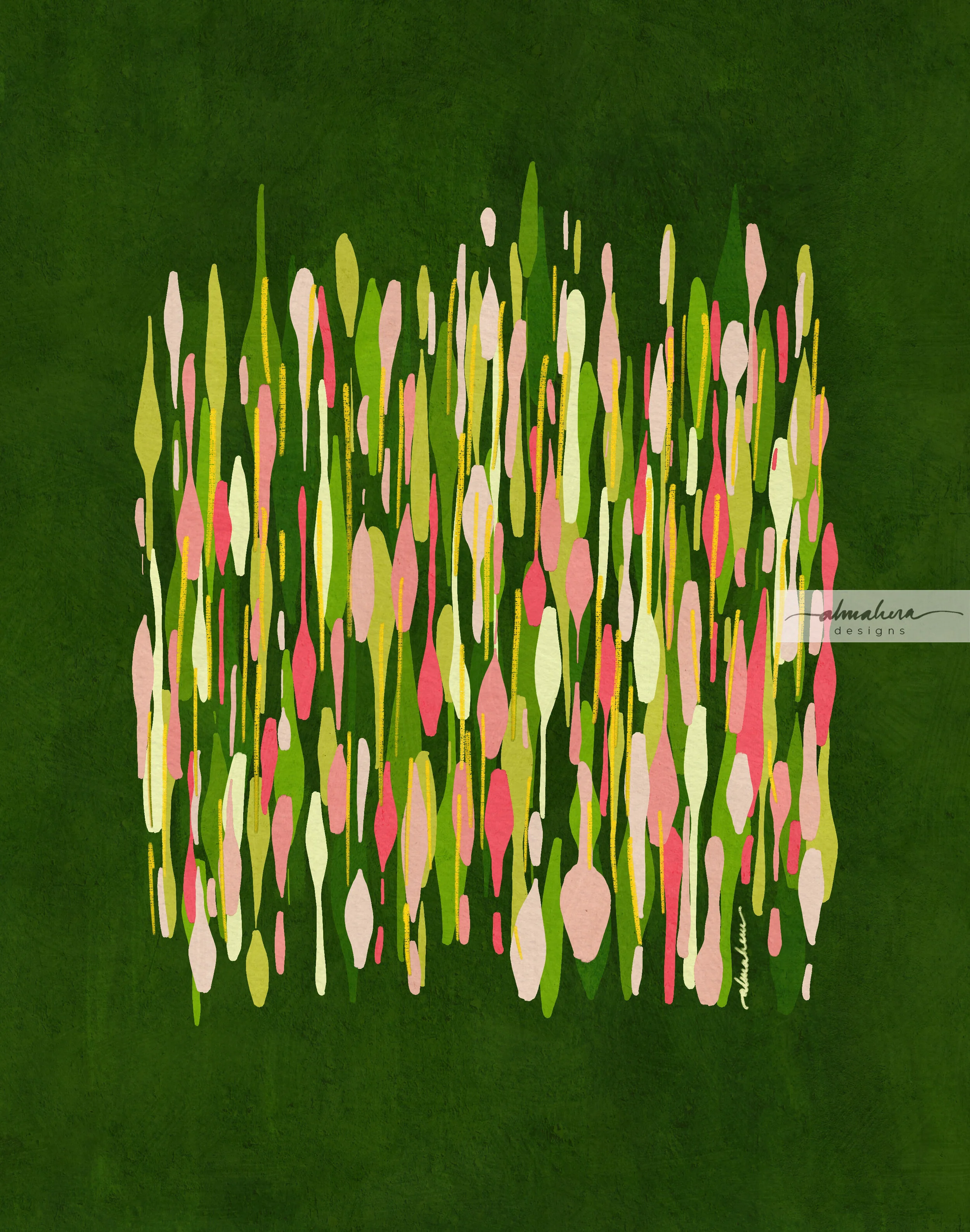
"Brush Strokes #1" - The first piece in the series. If the heavens cracked open and rained Akar Dani flowers, this is how I imagine it would look like. 

“Brush Strokes #1”

“Brush Strokes #1”

"Brush Strokes #2" - A variation on the same theme, but I wanted it to look a bit more gloopy and drippy; a bit like raindrops racing down a window pane. 

“Brush Strokes #2”

“Brush Strokes #2”

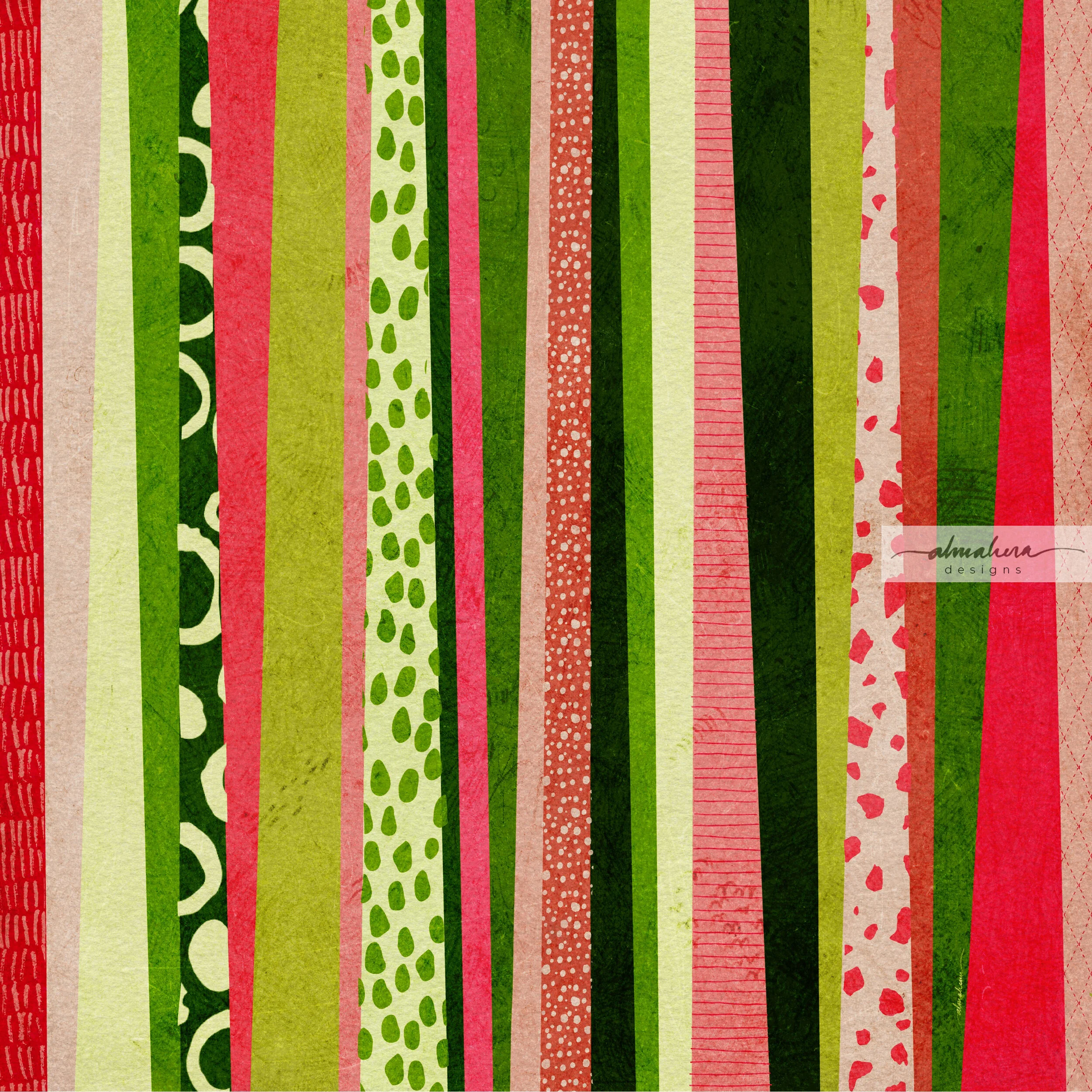
"Stripes" - Like a lot of people, I love me some good stripes! I initially painted stripes of equal width, thinking that the colours would be enough to lend it character. It still felt boring, though, and I started playing around with different widths until I decided to just let the lines go all over the place, and create wonky, lopsided stripes. I added random textures and patterns here and there - I wanted it to be a fun piece; something chaotic and colourful, something that would brighten up your mood. 

“Stripes”

“Stripes”

"Fish/Lilypads" - I enjoyed making "Brush Strokes #2" and I wanted to create another piece in the same vein, but one that felt a bit calmer and more deliberate. As I was painting this, I thought it looked like a school of (green) fish swimming through the (green) ocean, and went along with that image in my mind. After it was completed though, it looked more like lily pads. 

“Fish/Lilypads”

“Fish/Lilypads”

"Sidewalk" - By this time I was done playing around with random brush strokes, but I was still obsessed with the Akar Dani colour palette. I wanted to create something slightly more “structured”, but still organic and abstract. I was inspired by the pavement tiles near the neighbourhood shops. Like “Stripes”, this piece started out somewhat geometrically correct, but morphed into organic shapes and a riot of colours and patterns. 

“Sidewalk”

"Sidewalk" was supposed to be the last piece in this series… until one morning, I noticed a blank white wall where the luscious Akar Dani plant used to be. The owners of the house had pruned it, cut it down, with nary a trace to be seen or found. I was sad to see it gone; it used to brighten up my mornings so. I decided then that I needed to create another piece, one that actually featured the flower in some form. For some reason I wanted it to be a repeat pattern. The result was not one - but two patterns in a Damask style. I couldn’t decide between the two, so I kept both, and named them, imaginatively, “Akar Dani I”, and “Akar Dani II”

“Akar Dani I”

“Akar Dani I”

“Akar Dani II”

“Akar Dani II”

Unlike “Sidewalk”, these two patterns were really the final pieces in the series. I’d had my fun with the theme, and it was time for me to move on and explore other themes, other colours, and other tools. Once this lockdown is lifted and more businesses are allowed to operate again, I’d like to make these into art prints - I think they’d look nice. 

Until next time, stay safe! 

-A-

The Watercolour Batik

A friend of mine - J - is moving abroad for work, and she asked me to paint her something that she could bring with her, that would remind her of home. She said she had batik in mind, but gave me the freedom to explore other ideas, too.

Her commission was a much needed shot in the arm. We were eight weeks deep in the Movement Control Order aka MCO aka lockdown, and I was feeling a bit tired with very little motivation to paint or design any patterns. Between having the kiddo at home 24/7 (he’s at a very active and talkative stage right now), and the extra chores that inevitably came with the lockdown, I honestly just wanted to spend my downtime catching fish on Animal Crossing. So when J told me she wanted a painting, I was more than happy to set to work!

The “research”

I thought of all the traditional cultural references I could use, but I started with batik because that was what J had in mind. I rummaged through my wardrobe for pieces I could use as reference, but I have a laughable collection of batik sarung (I’m more of a t-shirt and shorts kinda person when lounging at home), and the batik baju kurungs and pareos I wear to weddings and raya events are more abstract and modern. I wanted something more traditional.

Thank heavens for Mr Google!

After browsing through pages and pages of batik images and pinning some I liked, I sketched out a few ideas and started thinking about the technique I wanted to use. Do I use masking fluid to try and replicate the wax resist technique employed by batik craftsmen (and women)? Or do I want to only use the motifs as inspiration? Do I want to make my piece look like batik, or do I want it loose and abstract?

I eventually decided not to use masking fluid, as I thought I could get more precise details with a brush or dip pen and white acrylic ink. (This is purely due to my inexperience and lack of practice with the medium, not a fault of the medium itself).

The colour palette

Most of the traditional batik that I used as reference had a lot of warm reds and blues, with some green and brown as accent colours. I wanted a softer colour palette instead; something more pastel-y. I was in the mood for cool pinks and purples at the time, so I built my colour palette around that, with some cool blues and greens thrown in.

It was a perfect opportunity to test out my new Sennelier paints :-)

The sketch(es)

I definitely needed a sketch for this piece; there were a lot of details that I wanted to plan out beforehand. I made several rough thumbnail sketches to figure out whether I wanted the piece to be an abstraction of traditional batik motifs, or something more “literal”. I eventually decided to go with the latter. In other words, the painting would have a badan kain (literally the “body”; the largest area of the batik sarung), a kepala kain (the “head”; a smaller, rectangular portion of the batik, where the motifs were usually different from the badan), and a gigi kain (the “teeth”, ie the margin that runs along the top and bottom edges of the batik sarung). There is also a broader margin called the gunung kain that runs below/above the upper/lower gigi kain, but I chose to exclude that detail.

The sketches.

The pucuk rebung motif was something I often found on the kepala kain of the batik pieces that I looked up for reference, so I wanted to include a simplified version of it in my painting. The motifs on the rest of the painting - on the badan, the papan (the two narrow rectangles in the kepala portion), and the gigi - were not based on any references. I left the tanah kain (literally “ground”, aka the background) white. I had tried a couple of mini test paintings with a background wash, but I preferred the way the colours popped against a white background. Had I used masking fluid, however, a background wash would’ve made more sense, and been closer in technique to the real batik process.

A simplified version of the pucuk rebung motif.

Bring on the bling!

As I was looking at all the different batik I’d googled, I realised that my favourites were the ones which had a lot of fine details and dots which added texture and highlights to the overall design. I liked the idea of a detailed, textured piece, and I’ve always enjoyed adding ink details (especially dots!) to a watercolour painting or doodle. I wanted to try out a newly acquired bottle of white acrylic ink, and I was tempted to add shimmery metallic details as well. Any excuse for some bling! I started out using a dip pen, then switched to the thinnest brush I own, and then found myself going back and forth between the two tools depending on my mood, undecided as to which one I preferred.

Mmmmm shimmery goodness…

Adding the metallic details was perhaps my favourite part of the process, so much so that I had to stop myself from covering the entire painting with tiny little metallic dots. Instead, when I reached the final portion of the background which was still untouched and paper-white, I decided to ask the opinions of friends - via an Instastories poll. The majority of those who replied voted for me to keep it clean, without any additional details - so the decision was made for me… and the painting was done!

The finished painting, ready to be delivered.

I actually painted a second option for J; also a batik-inspired piece. I typically do this - paint more than one option - if I have the time. It’s a way for me to experiment with different styles and approaches, and I just like to provide options if and when possible. It was this first painting that J chose eventually. The metallic details won her over, she said :-)

The piece is now safe in the hands of J. Hopefully it will survive their trip, and brighten up a wall of their new home.

-A-

Painting in Fuchsia

One of the first commissions I received was for a “moody” cityscape, so I painted a “melting” image of the KLCC Twin Towers and the KL Tower.

I used Daniel Smith’s “Moonglow” watercolour, which is a lovely, complex, granulating colour - thanks to its blend of three pigments: PG 18, PB 29, and PR 177 (ie Viridian, Ultramarine Blue, and Anthraquinoid Red). The deep violet hue lends itself nicely to the “moodiness” that I was looking for in the painting, and because the pigments granulate (ie when mixed with water, they separate from the binder and settle in the tiny valleys of the paper, leaving a grainy texture when the painting is dry), I didn’t really need to do much. I just let the pigments flow with the water, and let the water do most of the work. What resulted was a monochromatic painting that had depth, texture, and ultimately - character.


Moody KLCC.jpg

After I had completed the painting, another friend requested a similar one, but in fuchsia. From the outset I knew that this painting would have a totally different vibe from the first one, simply because of the colour; fuchsia isn’t a hue typically associated with gloominess or moodiness. This didn’t pose a problem at all, since the person who commissioned me - a friend from university days - never mentioned anything other than wanting it in that bright, cheerful shade. Why am I not surprised, I thought. Fuchsia is so her.

As I set about painting the piece, I realised that it would differ from the first painting not just in its colour and overall vibe, but also in the way I paint it. And along the way, I learnt a few things.

First of all, the characteristics of different pigments and, to a certain extent, brands of watercolour paint matter (only in the sense that some brands are more granulating than others). In this case, it was primarily the granulation of the pigments that threw me off. I tried using just one colour at first - Winsor & Newton’s Quinacridone Magenta (PR 122) - but I felt the result was a bit flat. I then mixed in a second colour - Daniel Smith’s Quinacridone Red (PV 19) - and tried painting in layers, but again, I didn’t like the result - it came out looking almost bloody and murderous. I don’t think that was what my friend had in mind. I tried mixing in a bit of M.Graham’s Hansa Yellow Deep (PY 97) and Quinacridone Violet (also PV 19, but a more violet version), but I found that the latter is a granulating colour, and didn’t sit well with the other three, which had little to no granulation at all. It also deepened the overall colour of the painting; it was no longer a bright, cheerful painting but a dark, shadowy one. Not what I wanted, either.

I tried layering… but it just ended up looking sinister.

I tried layering… but it just ended up looking sinister.

The granulating Quinacridone Violet just didn’t complement the other colours. At all.

The granulating Quinacridone Violet just didn’t complement the other colours. At all.

In the end I stuck with a mix of the yellow and the first two quinacridone colours, and added just a touch of Opera Rose (PR 122) - a bright, hot pink - to brighten things up. I liked it, but I still felt it needed something, so I took some gold paint and white paint marker and added some highlights - because why not?

Pretty, but lacking something…

Pretty, but lacking something…

That’s more like it. You can never go overboard with highlights, is what I say :-)

That’s more like it. You can never go overboard with highlights, is what I say :-)

When I started on this commission, I honestly thought it would just be a matter of painting the same image in a different colour. Turns out there was a bit more that I needed to understand and take into consideration, and in my opinion, although both the fuchsia and the Moonglow cityscapes are essentially the same image, they are two very different paintings.