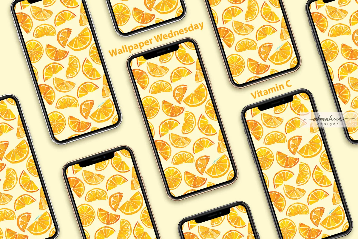
Introducing: Wallpaper Wednesday

If you like to change up your tech wallpapers and screensavers every so often, and if you like some of my patterns and artwork, then you may like…

Wallpaper Wednesdays!

On the first Wednesday of every month, one of my designs will be available as a free downloadable for you to use as a wallpaper or screensaver for your phone, iPad/tablet, laptop, and/or desktop. (For personal use only)

To kick things off, let me introduce…

Vitamin C!

Vitamin C_All devices_1200.jpg
Vitamin C_iPhone_1200.jpg
Vitamin C_iPad_1200.jpg

This pattern began as a random watercolour doodle in my sketchbook a couple of years ago. I had just gotten my hands on a set of Dr Ph Martins liquid watercolours, and I was trying them out. The doodles stayed in my sketchbook until recently, when I felt a bit uninspired and started leafing through my old sketchbooks. I found the sketch, and decided to practice making a seamless repeat pattern in Photoshop.

Orange Slices Sketch.jpg

Vitamin C is a fresh, fruity, and sunny pattern, which will brighten up a gloomy day (we’ve been having a lot of those lately).

I hope you like it, and I hope it’ll make you smile :-)

Enjoy!

Freebie: Merdeka Hibiscus Mobile and Desktop Wallpapers

It was Merdeka Day, so I attempted a loose painting of a hibiscus in my sketchbook to mark the occasion. It turned out better than I expected, and I liked it so much that I didn’t want to just leave it hidden in my sketchbook. I also didn’t want to bring my sketchbook around with me and keep opening to the page with the hibiscus painting every so often because err… I’m not that crazy. Not yet, at least.

So I created a wallpaper for my phone, instead.


Then I thought to myself, “we need things to be coordinated”, so I created wallpapers for my iPad, my laptop, and my iMac as well.


And because my 4-year old tells me that “sharing is caring”, I’ve decided to make these wallpapers available to you, too! If you like the Merdeka Hibiscus as much as I do, or if you’d just like to change up your tech backgrounds, or if you want to dress up your phone/tablet/computer in time for Malaysia Day, feel free to download any - or all - of the wallpapers below.*


*For personal use only.


The Watercolour Batik

A friend of mine - J - is moving abroad for work, and she asked me to paint her something that she could bring with her, that would remind her of home. She said she had batik in mind, but gave me the freedom to explore other ideas, too.

Her commission was a much needed shot in the arm. We were eight weeks deep in the Movement Control Order aka MCO aka lockdown, and I was feeling a bit tired with very little motivation to paint or design any patterns. Between having the kiddo at home 24/7 (he’s at a very active and talkative stage right now), and the extra chores that inevitably came with the lockdown, I honestly just wanted to spend my downtime catching fish on Animal Crossing. So when J told me she wanted a painting, I was more than happy to set to work!

The “research”

I thought of all the traditional cultural references I could use, but I started with batik because that was what J had in mind. I rummaged through my wardrobe for pieces I could use as reference, but I have a laughable collection of batik sarung (I’m more of a t-shirt and shorts kinda person when lounging at home), and the batik baju kurungs and pareos I wear to weddings and raya events are more abstract and modern. I wanted something more traditional.

Thank heavens for Mr Google!

After browsing through pages and pages of batik images and pinning some I liked, I sketched out a few ideas and started thinking about the technique I wanted to use. Do I use masking fluid to try and replicate the wax resist technique employed by batik craftsmen (and women)? Or do I want to only use the motifs as inspiration? Do I want to make my piece look like batik, or do I want it loose and abstract?

I eventually decided not to use masking fluid, as I thought I could get more precise details with a brush or dip pen and white acrylic ink. (This is purely due to my inexperience and lack of practice with the medium, not a fault of the medium itself).

The colour palette

Most of the traditional batik that I used as reference had a lot of warm reds and blues, with some green and brown as accent colours. I wanted a softer colour palette instead; something more pastel-y. I was in the mood for cool pinks and purples at the time, so I built my colour palette around that, with some cool blues and greens thrown in.

It was a perfect opportunity to test out my new Sennelier paints :-)

The sketch(es)

I definitely needed a sketch for this piece; there were a lot of details that I wanted to plan out beforehand. I made several rough thumbnail sketches to figure out whether I wanted the piece to be an abstraction of traditional batik motifs, or something more “literal”. I eventually decided to go with the latter. In other words, the painting would have a badan kain (literally the “body”; the largest area of the batik sarung), a kepala kain (the “head”; a smaller, rectangular portion of the batik, where the motifs were usually different from the badan), and a gigi kain (the “teeth”, ie the margin that runs along the top and bottom edges of the batik sarung). There is also a broader margin called the gunung kain that runs below/above the upper/lower gigi kain, but I chose to exclude that detail.

The sketches.

The pucuk rebung motif was something I often found on the kepala kain of the batik pieces that I looked up for reference, so I wanted to include a simplified version of it in my painting. The motifs on the rest of the painting - on the badan, the papan (the two narrow rectangles in the kepala portion), and the gigi - were not based on any references. I left the tanah kain (literally “ground”, aka the background) white. I had tried a couple of mini test paintings with a background wash, but I preferred the way the colours popped against a white background. Had I used masking fluid, however, a background wash would’ve made more sense, and been closer in technique to the real batik process.

A simplified version of the pucuk rebung motif.

Bring on the bling!

As I was looking at all the different batik I’d googled, I realised that my favourites were the ones which had a lot of fine details and dots which added texture and highlights to the overall design. I liked the idea of a detailed, textured piece, and I’ve always enjoyed adding ink details (especially dots!) to a watercolour painting or doodle. I wanted to try out a newly acquired bottle of white acrylic ink, and I was tempted to add shimmery metallic details as well. Any excuse for some bling! I started out using a dip pen, then switched to the thinnest brush I own, and then found myself going back and forth between the two tools depending on my mood, undecided as to which one I preferred.

Mmmmm shimmery goodness…

Adding the metallic details was perhaps my favourite part of the process, so much so that I had to stop myself from covering the entire painting with tiny little metallic dots. Instead, when I reached the final portion of the background which was still untouched and paper-white, I decided to ask the opinions of friends - via an Instastories poll. The majority of those who replied voted for me to keep it clean, without any additional details - so the decision was made for me… and the painting was done!

The finished painting, ready to be delivered.

I actually painted a second option for J; also a batik-inspired piece. I typically do this - paint more than one option - if I have the time. It’s a way for me to experiment with different styles and approaches, and I just like to provide options if and when possible. It was this first painting that J chose eventually. The metallic details won her over, she said :-)

The piece is now safe in the hands of J. Hopefully it will survive their trip, and brighten up a wall of their new home.

-A-

The Overfloor Pattern Commission

A few months ago, a friend and former colleague of mine, R, commissioned a seamless repeat pattern for a custom-print large deskmat - one of those long rectangular ones on which you place your keyboard and mouse. Popular, I believe, with gamers.

It was my first pattern commission.

The “Brief”

The “brief” was simple; he wanted me to design a pattern based on the “Overfloor” - the name given to one of the buildings of the school he went to. It is perhaps the most recognisable feature of his school, with its pseudo Graeco-Roman pillars and the wide expanse of green fronting it (the building overlooks the school’s rugby field). I guess I should explain here that the school is well known not only for its academic achievements, but also (perhaps more so?) for the fervent loyalty and pride displayed by its alumni. Being married to an alumnus myself, I was quite familiar with their fealty, and I’ve seen many an alumni tie, kain sampin, and lanyard out in the wild to understand that an Overfloor deskmat was bound to join the family one day. That I would have anything to do with it was something I had not expected.

Sure, I said. I’ll see what I can do.

This was going to be a new challenge for me. I hadn’t attempted designing a pattern based on buildings prior to this, and I couldn't (still can’t!) draw a straight line to save my life. Why do you think all my doodles are circles?!? Yes, there are rulers and set squares and fancy geometry sets, but I obstinately chose to sketch and draw freehand, and celebrate all the wonkiness and non-perpendicular angles that came with it.

Ink & watercolour sketch. It looks as if the roof is ablaze. I promise you it’s unintentional.

I attempted a few styles: a straightforward pencil and ink sketch, loose charcoal sketches, sketches with and without watercolour, and geometrically-perfect vector-based stylised shapes. I digitised the sketches and worked on them in Procreate and Photoshop for when I wanted to retain the gritty, grainy quality of the charcoal lines or the painterly look of watercolour, or in Illustrator for when I felt the drawings would translate well to vectors.

Charcoal & watercolour sketch. Wonky pillar alert.

The Colour Palette

Choosing the colour palette was the easiest part of the entire process. It only made sense to use the school colours, and R had included a specific background colour in his brief. He’d even given me the hex code - which made it that much easier for me. The colour palette, in short, had been predetermined from the get go.

I played around with several patterns and different iterations of each, and ended up with a selection I was comfortable with. I showed them to R, and thankfully he liked what I’d done. It being my first pattern commission and all, I’d been worried that I’d strayed too far from the mark.

R chose a pattern from the selection I’d given him, and sent it to the printers. It would take a couple of weeks or so, the printers told him. I hope it turns out ok, I silently prayed to myself. I then pushed it to the back of my mind and went on with life.

The Pattern In The Wild

After an episode with the wretched Influenza B (the toddler), and the frustrating annual affliction that is the haze (the country), R messaged me with some good news. The deskmats had arrived, and they looked good!

Deskmat2.jpg

Aaaaaahhh to see my pattern out in the wild….

Deskmat3.jpg
Deskmat4.jpg

It feels nice.

It really does.