The Akar Dani Series

There's a house somewhere in our neighbourhood that used to have a beautifully lush Akar Dani plant cascading over their back wall. I used to walk past it in the mornings, and every time I did, I felt happy. The vibrant fuschia and pale pink colours of the flowers lifted my spirits, and it inspired me to create the Akar Dani series, a collection of abstract pieces centred around the colour palette of the Akar Dani flowers; a range of vibrant pinks and deep emerald greens. 

Akar Dani flowers

Akar Dani flowers

It was also an opportunity for me to play around with a newly acquired set of Procreate gouache brushes from one of my favourite illustrators, Lisa Glanz. 

"Brush Strokes #1" - The first piece in the series. If the heavens cracked open and rained Akar Dani flowers, this is how I imagine it would look like. 

“Brush Strokes #1”

“Brush Strokes #1”

"Brush Strokes #2" - A variation on the same theme, but I wanted it to look a bit more gloopy and drippy; a bit like raindrops racing down a window pane. 

“Brush Strokes #2”

“Brush Strokes #2”

"Stripes" - Like a lot of people, I love me some good stripes! I initially painted stripes of equal width, thinking that the colours would be enough to lend it character. It still felt boring, though, and I started playing around with different widths until I decided to just let the lines go all over the place, and create wonky, lopsided stripes. I added random textures and patterns here and there - I wanted it to be a fun piece; something chaotic and colourful, something that would brighten up your mood. 
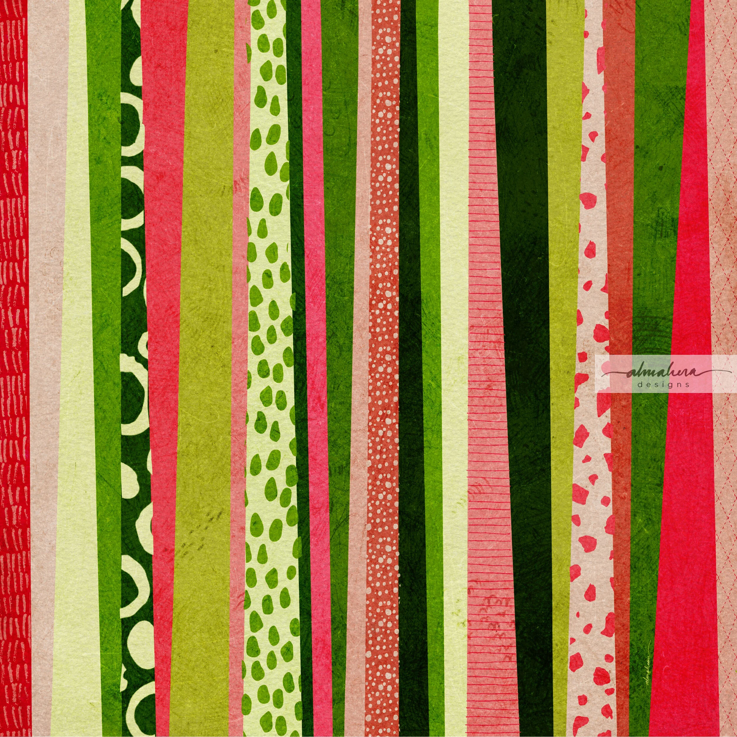
“Stripes”

“Stripes”

"Fish/Lilypads" - I enjoyed making "Brush Strokes #2" and I wanted to create another piece in the same vein, but one that felt a bit calmer and more deliberate. As I was painting this, I thought it looked like a school of (green) fish swimming through the (green) ocean, and went along with that image in my mind. After it was completed though, it looked more like lily pads. 

“Fish/Lilypads”

“Fish/Lilypads”

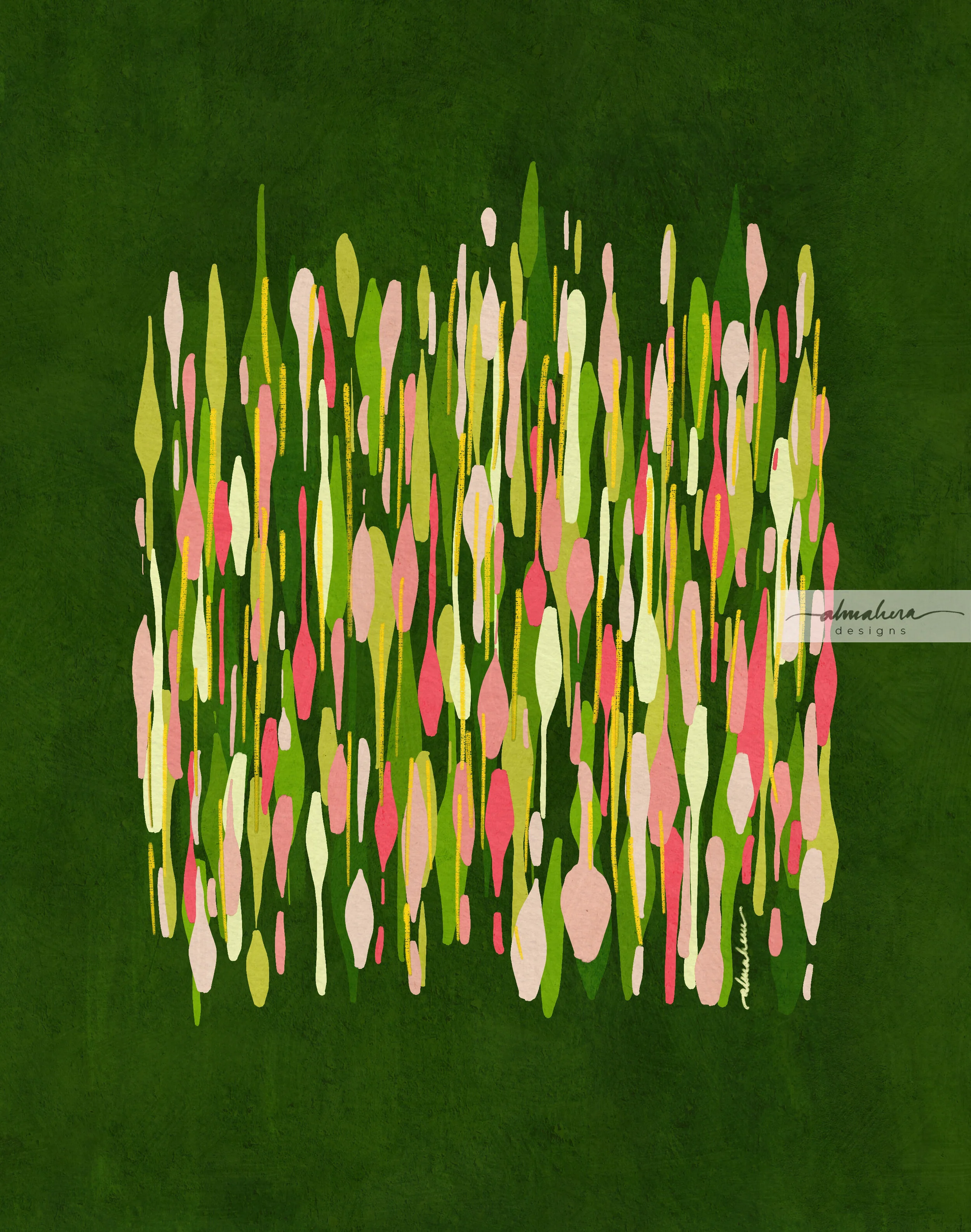
"Sidewalk" - By this time I was done playing around with random brush strokes, but I was still obsessed with the Akar Dani colour palette. I wanted to create something slightly more “structured”, but still organic and abstract. I was inspired by the pavement tiles near the neighbourhood shops. Like “Stripes”, this piece started out somewhat geometrically correct, but morphed into organic shapes and a riot of colours and patterns. 

“Sidewalk”

"Sidewalk" was supposed to be the last piece in this series… until one morning, I noticed a blank white wall where the luscious Akar Dani plant used to be. The owners of the house had pruned it, cut it down, with nary a trace to be seen or found. I was sad to see it gone; it used to brighten up my mornings so. I decided then that I needed to create another piece, one that actually featured the flower in some form. For some reason I wanted it to be a repeat pattern. The result was not one - but two patterns in a Damask style. I couldn’t decide between the two, so I kept both, and named them, imaginatively, “Akar Dani I”, and “Akar Dani II”

“Akar Dani I”

“Akar Dani I”

“Akar Dani II”

“Akar Dani II”

Unlike “Sidewalk”, these two patterns were really the final pieces in the series. I’d had my fun with the theme, and it was time for me to move on and explore other themes, other colours, and other tools. Once this lockdown is lifted and more businesses are allowed to operate again, I’d like to make these into art prints - I think they’d look nice. 

Until next time, stay safe! 

-A-

The Watercolour Batik

A friend of mine - J - is moving abroad for work, and she asked me to paint her something that she could bring with her, that would remind her of home. She said she had batik in mind, but gave me the freedom to explore other ideas, too.

Her commission was a much needed shot in the arm. We were eight weeks deep in the Movement Control Order aka MCO aka lockdown, and I was feeling a bit tired with very little motivation to paint or design any patterns. Between having the kiddo at home 24/7 (he’s at a very active and talkative stage right now), and the extra chores that inevitably came with the lockdown, I honestly just wanted to spend my downtime catching fish on Animal Crossing. So when J told me she wanted a painting, I was more than happy to set to work!

The “research”

I thought of all the traditional cultural references I could use, but I started with batik because that was what J had in mind. I rummaged through my wardrobe for pieces I could use as reference, but I have a laughable collection of batik sarung (I’m more of a t-shirt and shorts kinda person when lounging at home), and the batik baju kurungs and pareos I wear to weddings and raya events are more abstract and modern. I wanted something more traditional.

Thank heavens for Mr Google!

After browsing through pages and pages of batik images and pinning some I liked, I sketched out a few ideas and started thinking about the technique I wanted to use. Do I use masking fluid to try and replicate the wax resist technique employed by batik craftsmen (and women)? Or do I want to only use the motifs as inspiration? Do I want to make my piece look like batik, or do I want it loose and abstract?

I eventually decided not to use masking fluid, as I thought I could get more precise details with a brush or dip pen and white acrylic ink. (This is purely due to my inexperience and lack of practice with the medium, not a fault of the medium itself).

The colour palette

Most of the traditional batik that I used as reference had a lot of warm reds and blues, with some green and brown as accent colours. I wanted a softer colour palette instead; something more pastel-y. I was in the mood for cool pinks and purples at the time, so I built my colour palette around that, with some cool blues and greens thrown in.

It was a perfect opportunity to test out my new Sennelier paints :-)

The sketch(es)

I definitely needed a sketch for this piece; there were a lot of details that I wanted to plan out beforehand. I made several rough thumbnail sketches to figure out whether I wanted the piece to be an abstraction of traditional batik motifs, or something more “literal”. I eventually decided to go with the latter. In other words, the painting would have a badan kain (literally the “body”; the largest area of the batik sarung), a kepala kain (the “head”; a smaller, rectangular portion of the batik, where the motifs were usually different from the badan), and a gigi kain (the “teeth”, ie the margin that runs along the top and bottom edges of the batik sarung). There is also a broader margin called the gunung kain that runs below/above the upper/lower gigi kain, but I chose to exclude that detail.

The sketches.

The pucuk rebung motif was something I often found on the kepala kain of the batik pieces that I looked up for reference, so I wanted to include a simplified version of it in my painting. The motifs on the rest of the painting - on the badan, the papan (the two narrow rectangles in the kepala portion), and the gigi - were not based on any references. I left the tanah kain (literally “ground”, aka the background) white. I had tried a couple of mini test paintings with a background wash, but I preferred the way the colours popped against a white background. Had I used masking fluid, however, a background wash would’ve made more sense, and been closer in technique to the real batik process.

A simplified version of the pucuk rebung motif.

Bring on the bling!

As I was looking at all the different batik I’d googled, I realised that my favourites were the ones which had a lot of fine details and dots which added texture and highlights to the overall design. I liked the idea of a detailed, textured piece, and I’ve always enjoyed adding ink details (especially dots!) to a watercolour painting or doodle. I wanted to try out a newly acquired bottle of white acrylic ink, and I was tempted to add shimmery metallic details as well. Any excuse for some bling! I started out using a dip pen, then switched to the thinnest brush I own, and then found myself going back and forth between the two tools depending on my mood, undecided as to which one I preferred.

Mmmmm shimmery goodness…

Adding the metallic details was perhaps my favourite part of the process, so much so that I had to stop myself from covering the entire painting with tiny little metallic dots. Instead, when I reached the final portion of the background which was still untouched and paper-white, I decided to ask the opinions of friends - via an Instastories poll. The majority of those who replied voted for me to keep it clean, without any additional details - so the decision was made for me… and the painting was done!

The finished painting, ready to be delivered.

I actually painted a second option for J; also a batik-inspired piece. I typically do this - paint more than one option - if I have the time. It’s a way for me to experiment with different styles and approaches, and I just like to provide options if and when possible. It was this first painting that J chose eventually. The metallic details won her over, she said :-)

The piece is now safe in the hands of J. Hopefully it will survive their trip, and brighten up a wall of their new home.

-A-

The #30DayChallenge

Helloooooo there! Long time no write! We’re a month into the new year… how has 2020 treated you so far? I know we’ve had quite a bit of sad and scary news in the past few weeks, but I hope that at the same time you’ve had some positive starts - or at the very least, something exciting and wonderful to look forward to at some point in this year.

Like a lot of other people, I approached 2020 with a list of goals for myself. It’s a pretty short list - I’m trying to be realistic - and one of my goals is to have a portfolio of pattern designs by the end of the year. If not a complete portfolio, at least one pattern collection (ie 8-12 patterns designed around a central theme). I would have to choose the ones I feel are my best designs, and to do that, I’d have to design many, many patterns (at least a hundred). Which means this year will be a year for me to practise, practise, practise.

That was when, just a few days before the start of the year, I set myself a challenge: to design one repeat pattern a day, every day, in the month of January, and post it on Instagram. The #30DayChallenge. Yes, January has 31 days, but I thought a nice round number like 30 would look and sound nicer, and I could give myself a day off on the 31st.

Why did I do it?

I wanted to do the challenge to force myself to practise regularly, and I was hoping that the daily deadlines would instil some form of discipline and establish an efficient workflow in my day-to-day routine. I also wanted all 30 patterns to be seamless repeat patterns, as I wanted to train myself to use Illustrator (and other tools) quickly and efficiently.

So how did I fare?

Well firstly, I managed to complete all 30 days (yayyy!). I honestly thought that I would end up skipping a few days, perhaps due to sick days, toddler/family emergencies, and the most likely hurdle: general laziness. Thankfully life was kind and didn’t throw me any curveballs, and I managed to keep my lazy bones in check.

The more important question is, what did I learn from this exercise?

1. Don’t overthink it. Just do.

I realised very early in the challenge that whenever I have even an inkling of an idea, I shouldn’t mull over it for too long. Just run with it. It doesn’t matter that the idea may not yet be fully developed; just start sketching. The pattern will develop along the way. It will take form as I’m sketching out the motifs, and more so after I digitise the sketch and work on it in Illustrator (or Photoshop, or Procreate). Sometimes the sketch won’t turn out the way I imagined it would (I’m looking at you, goat-rabbit-donkey monstrosity in Day 4:“Hippity Hop”), but go along with it anyway. In the context of this exercise, it’s the process that matters.

Day 4: “Hippity Hop”. The dark grey goat-rabbit-donkey is staring straight at me, accusingly.

Day 4: “Hippity Hop”. The dark grey goat-rabbit-donkey is staring straight at me, accusingly.

2. Ideas will morph and evolve.

Some days I had a very clear idea of how I wanted my pattern to look like, and I managed to achieve it (Day 1: “Houses” and Day 30: “Dance”). Other days, I knew exactly what I wanted to sketch, or what I was inspired by, but absolutely no idea where I was going with it. I would play around with the motifs until something clicked (Day 6: “Strings” and Day 15: “Anyam”). Then there were days when try as I might, I just couldn’t translate the vision I had in my mind to the end design (Day 2: “Ombak” and Day 17: “Bougainvillae”). The best and most rewarding instance however, was when one source of inspiration led to several designs. Towards the end of the month, I was inspired by a metal filigree art piece I’d seen hanging on a wall in a hotel. I started doodling filigree patterns, and this resulted in not one, but five consecutive tiled filigree designs, each one “evolving” into the next iteration. (Day 26: “Filigree”, Day 27: “Tiles”, Day 28: “Spring”, Day 29: “Kerawang”, and Day 30: “Dance”). I’d seemingly entered into a filigree/kerawang phase of sorts; one I would happily revisit.

Beginner’s Luck? My very first pattern of the challenge, “Houses” turned out just as I had envisioned it. It took until the very last day of the challenge for this to happen again.

Beginner’s Luck? My very first pattern of the challenge, “Houses” turned out just as I had envisioned it. It took until the very last day of the challenge for this to happen again.

I hit a stumbling block on the second day; this was not the pattern I had in mind. I wasn’t happy with it, but I posted it anyway.

I hit a stumbling block on the second day; this was not the pattern I had in mind. I wasn’t happy with it, but I posted it anyway.

3. Inspiration is everywhere.

Daily deadlines meant that I didn’t have the time to “look for inspiration”. I needed to use whatever I had at the time, and it could come from anywhere. It could be something I’d read (Day 1: “Houses” and Day 13: “Crossword”), or a song I’d been listening to (Day 3: “Better In Colour”). It could come from experiences (Day 2: “Ombak” and Day 4: “Hippity Hop”), or from random things I notice in places I happen to be at (Day 6: “Strings”, Day 16: “SevenEight Lay Them Straight”, and Day 24: “Cozy”). There was a day where I “cheated”, and browsed through my old sketchbooks to look for old sketches that I could use (Day 21: “EllieFunt”).

There were days when I wasn’t inspired by anything specific, but I just felt like making marks on paper, or doodling lines and shapes (Day 7: “Kusut” and Day 10: “Check Check Chequer”).

This scene inspired Day 4: “Hippity Hop”.

This scene inspired Day 4: “Hippity Hop”.

Day 7: “Kusut”. This wasn’t inspired by anything in particular; I just felt like doodling circles and lines.

Day 7: “Kusut”. This wasn’t inspired by anything in particular; I just felt like doodling circles and lines.

4. Every pattern has a story.

Each time I posted a pattern on my Instagram account, I tried to write something about it; usually what inspired it, or something about the design process. I learnt that having a story - and sharing it - made a design more interesting (to me, at least). It gives meaning to what I create, and to those who view it.

5. Developing a personal style requires more practice.

I knew that I would have to create far more than 30 patterns for a personal style to emerge, but I was still hoping that I could see a modicum of identity peeking through. That hasn’t happened yet, as far as I can see, and that’s fine. It just means I need to design more and more patterns, and I see nothing wrong with that.

So what’s next?

Will I attempt another #30DayChallenge, or something similar? I thoroughly enjoyed the excercise, so I think I will, but perhaps not too soon. For now I need to do some housekeeping (hello, 196 unread emails!), and work on some other areas I’d like to improve. I’ll slowly put the patterns up on products in my Society6 shop, and I’m planning to make some available as free downloadable wallpaper/screensavers. So watch out for that!

If you followed me on my #30DayChallenge, thank you! I hope you enjoyed my patterns. If you have any favourites, do let me know. It’d be nice to see what everyone’s opinions and tastes are like.

If you haven’t seen it yet and your curiosity is piqued, all 30 patterns are on my Instagram page, @almaheradesigns. Or you can click on the link at the top of my site. Do let me know what you think.

Until next time, toodles!

-A-


Watercolour Doodles: Drifting

I remember this one. I had Yayoi Kusama on my mind, and I was filling my sketchbook pages with spiralling lines of polka dots and circles. Some in ascending order of size, others descending. Some snaked their way across the pages of my book in monochromatic fashion, others skipped and hopped through a rainbow of colours.

It was therapeutic. I would zone out while painting those circles, one by one, trying to make each one just slightly smaller or bigger than the previous one, moving from one shade to the next.

Yayoi Kusama on my mind.

Yayoi Kusama on my mind.

Gimme all the colours!

Gimme all the colours!

Then I got sick of circles and polka dots.

So I painted squares instead.

I was also sick of the orderliness of the shapes gradually ascending or descending in size, and I wanted some negative space.

So I ended up with this:

Drifting_1800px.jpg

Drifting

I had a new addition to my paints at the time, and I used it for this painting. It was Daniel Smith’s Undersea Green; a colour that, for me, conjures images of scaly reptiles, seaweed swaying in the ocean depths, and humid mangrove swamps. If you’re a cat owner, like me, it may also remind you of one of the more wonderful perks of having a pet cat: hairball vomit.

But I’m pretty sure you’d agree that “Undersea Green” is a much better name than “Cat Vomit”, or “Hairball”.

And I can promise you I was NOT thinking of my cat’s occasional gifts to us when I was painting this.

Watercolour Doodles: Urban Living

I’d gotten my hands on some new paints, and was swatching all the colours for reference. I had some leftover in my palette, and I didn’t want to waste any of it, so this happened:

Original Doodle_1800.jpg

The Doodle

It looked like a bunch of high rise apartments to me, so I digitised it and added some details. I like the look of watercolour and ink; I think - especially with more loose or abstract watercolour pieces - it lends a playful, illustrative, vibe. So in Procreate, I played around with some “inky” details:

Urban Living_1800.jpg

Urban Living

I also wanted to try another style, so I eschewed the ink outlines, added some shading to give the shapes some depth, and then had fun with splatters:

Urban Living2_1800.jpg

Urban Living 2

I can’t make up my mind which one I like better; some days I prefer one, some days I prefer the other.

Which one do YOU like, and what do they look like to you?

Watercolour Doodles: Bubbles or Doughnuts?

I had just gotten my hands on a set of Dr Ph Martin’s Radiant Watercolours and I wanted to test them out. Once again my doodles took the form of circles - imperfect ones, but circles nonetheless. As I was painting these, my first thought was that they looked like those chunky, translucent, lucite rings that came in an array of fun rainbow hues and were popular during the 1960s (and made a brief resurgence last year).

When I looked at it again a few days later, I thought of bubbles.

When my three-year old watched me clean up the digital copy on Procreate, he said they were doughnuts. Maybe he was just hungry.

What do you see?

Also, which background do you prefer?

Bubbles Original.jpg

The Original Doodle

Bubbles Pattern Light_1800px.jpg

The Pattern

Bubble or doughnut?

Bubbles Pattern Dark_1800px.jpg

The “Darker” Version

I somewhat prefer the version with the midnight blue background; I think it makes the colours pop and make them almost neon-like. Disco bubbles! :-)

Watercolour Doodles: Orange Polka

I’ve been struggling to find ideas or inspiration for new patterns or paintings lately, so I decided to look through my sketchbook to find old watercolour doodles to breathe new life into. I found a few that looked half decent, so I scanned them and cleaned them up in Procreate. I then created seamless repeat patterns in Photoshop.

I’ve been meaning to learn how to use Photoshop for a while now; there are times when I want to use watercolour to paint motifs for a pattern, and Photoshop retains that lovely painterly look you get from watercolour. It’s possible to use Illustrator as well, but there are certain limitations and for it to work I would need to paint with Illustrator in mind.

In any case, this has been a good exercise for me. Using Procreate instead of Photoshop to clean up the digitised paintings/doodles is great because I’m not stuck to my desk and I can do it anytime and anywhere; while waiting for my son in swim class, while taking a quick coffee break in the morning, or while listening to an audiobook.

Once I’ve cleaned it up (nothing fancy; I just remove the background and clean up the edges. Maybe adjust the hue and saturation a bit), I open it up in Photoshop and create a repeat. It’s actually not as complicated as I thought it would be. I still find Illustrator easier, but it’s nice being able to use both.

As I was going through my doodles, I noticed that there were quite a few pages filled with circles and polka dots; it seems that my default doodle is circles. Does that mean anything? No idea.

This pattern I’ve named “Orange Polka” (how original!), was done using watercolours, Finetec metallic pigments, and colour pencils. The metallic sheen of the Finetec pigments didn’t translate well digitally; but that only means there’s more for me to learn in Photoshop! :-)

Orange Polka Pattern_1800px.jpg

Orange Polka

Orange Polka Original.jpg

THE ORIGINAL ARTWORK/DOODLE

Sargasso

I didn’t feel like designing another floral pattern so soon after “Wild Garden” (check out my previous post here), but at the same time, I didn’t have an idea what to draw or paint.

So I put some music on, and just let my pen wander mindlessly on the page (iPad actually; I used the Procreate app for this). I’ve realised that when I’m just doodling aimlessly, I tend to gravitate towards organic lines and shapes, playing with the amount of pressure I apply on the brush or pen to get that nice, organic, variation in line thickness.

As the lines started forming, I imagined walking through a hanging curtain of luminescent, glowing vines. I went with this thought and gave it a dark background to make the colours pop and provide the illusion of luminescence.

Once the piece was completed, however, it looked to me more like seaweed. An old memory was triggered: that of me as a child flipping through a book (or a magazine, I can’t remember exactly), and landing on images of the Sargasso Sea, and the Sargassum seaweed after which it is named. The distinct berry-shaped air bladders and its unique name must have made an impression on me somehow, and the images were buried deep in the recesses of my mind. Whether this design somehow uncovered this memory, or whether I was subconsciously reaching into the annals of my mind as I was drawing this piece, I will never know.

Either way, I have named this piece Sargasso, after the sea, and the seaweed it is famous for.

Sargasso_April.jpg

I’ve also placed this design on a few products in my Society6 shop. You can click on the image to go to the product, or check out more here.