Introducing: Wallpaper Wednesday

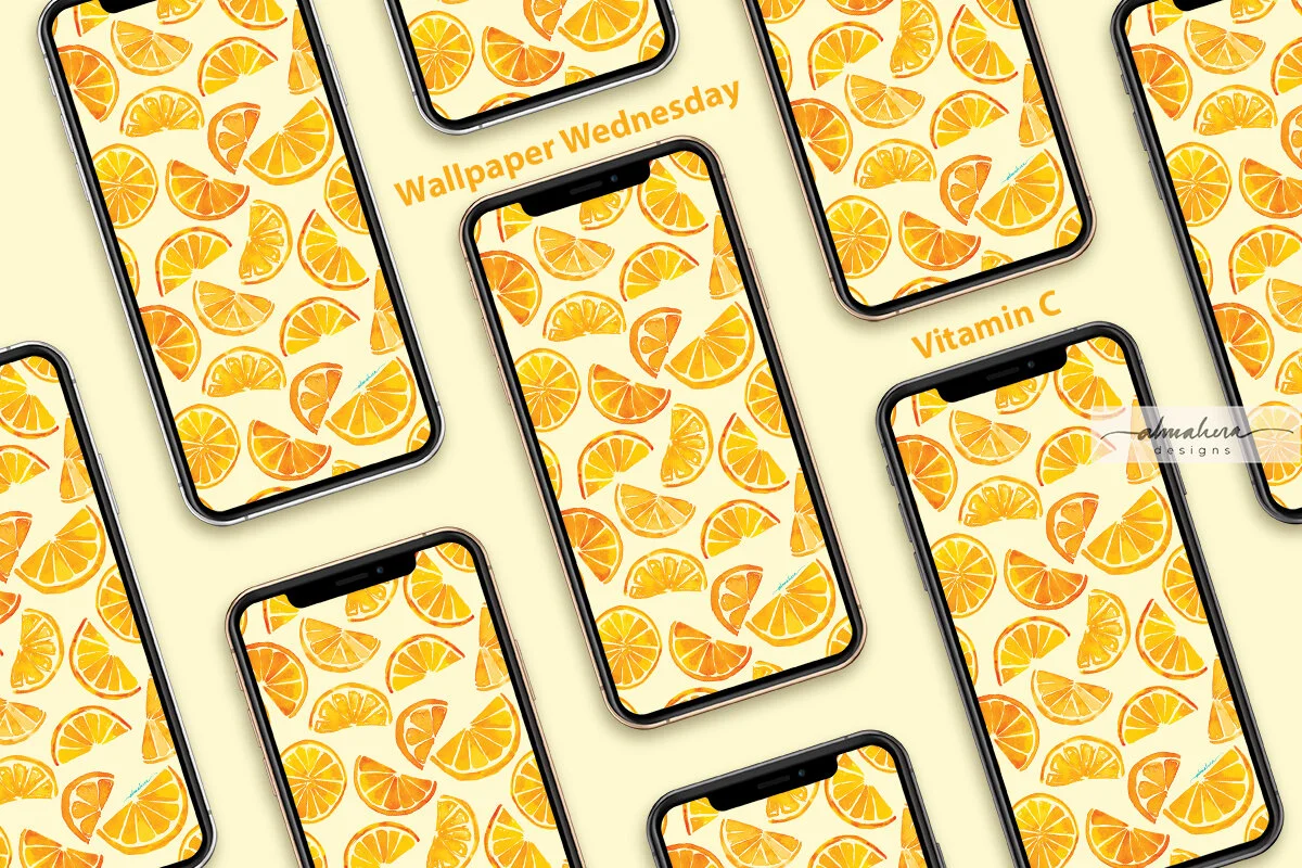
If you like to change up your tech wallpapers and screensavers every so often, and if you like some of my patterns and artwork, then you may like…

Wallpaper Wednesdays!

On the first Wednesday of every month, one of my designs will be available as a free downloadable for you to use as a wallpaper or screensaver for your phone, iPad/tablet, laptop, and/or desktop. (For personal use only)

To kick things off, let me introduce…

Vitamin C!

Vitamin C_All devices_1200.jpg
Vitamin C_iPhone_1200.jpg
Vitamin C_iPad_1200.jpg

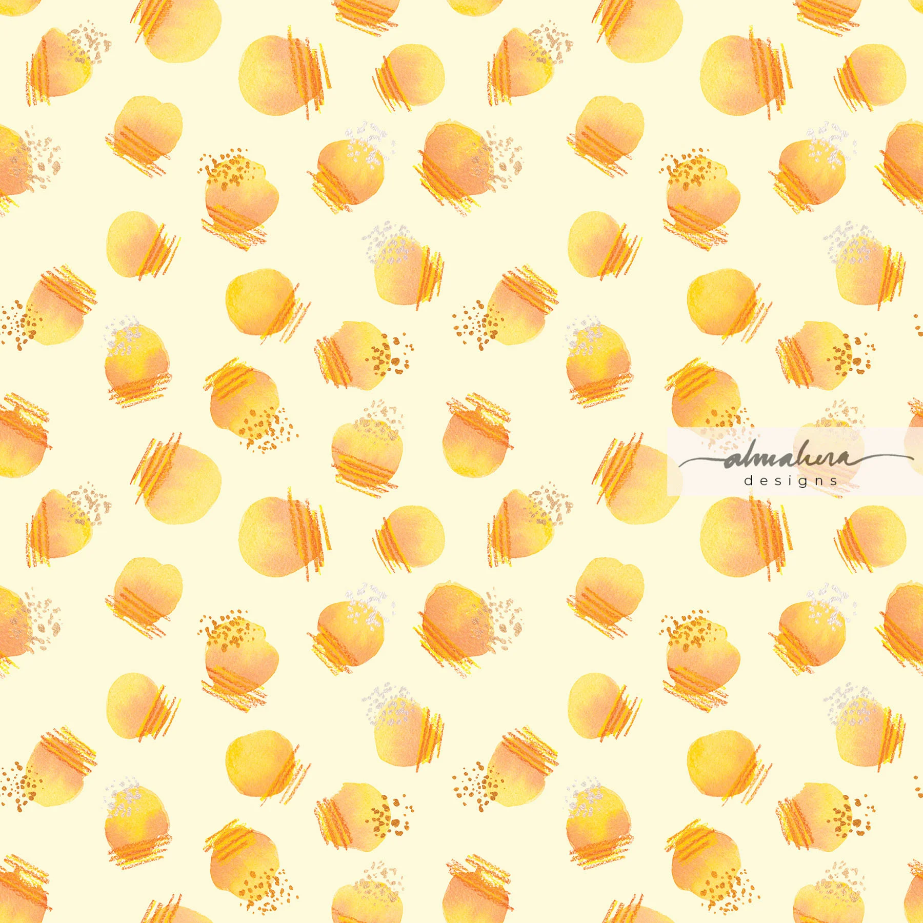
This pattern began as a random watercolour doodle in my sketchbook a couple of years ago. I had just gotten my hands on a set of Dr Ph Martins liquid watercolours, and I was trying them out. The doodles stayed in my sketchbook until recently, when I felt a bit uninspired and started leafing through my old sketchbooks. I found the sketch, and decided to practice making a seamless repeat pattern in Photoshop.

Orange Slices Sketch.jpg

Vitamin C is a fresh, fruity, and sunny pattern, which will brighten up a gloomy day (we’ve been having a lot of those lately).

I hope you like it, and I hope it’ll make you smile :-)

Enjoy!

Transition

I love autumn; it’s my favourite season of the year. I love everything about it: the cool, crisp air; the smell of apple and cinnamon and cloves that gently surrounds you as you browse through the markets; and the colours.

The gorgeous, gorgeous, colours. The reds, the golds, the deep, burnt oranges… so rich and warm and stunning.

Did I mention I love the colours of autumn?

Living on the equator, though, means that the only seasons we get are hot and balmy, hot and hazy, and tropical thunderstorms with a dash of flash floods. Which means I need to live vicariously through my watercolours.

Transition_1_1800px.jpg

Transition I

Transition_2_1800px.jpg

Transition II

Like a lot of the stuff I’ve been doing lately, these pieces started out as watercolour doodles (I was actually doodling mimosa flowers and leaves for another piece). As usual, I then digitised the doodles and continued working on it in Procreate. I played around with different colours and hues, and added some inky details.

To be honest, I was initially trying to channel an Andy Warhol vibe when I was creating these pieces, but somewhere along the way I started thinking of the changing colours of leaves in autumn, and I decided to go with that instead.

Transition II is my personal favourite; and now that I look at it, the colours of Transition I remind me of a flag - I just can’t remember which country.

What do you see?

And which season’s your favourite?

Watercolour Doodles: Urban Living

I’d gotten my hands on some new paints, and was swatching all the colours for reference. I had some leftover in my palette, and I didn’t want to waste any of it, so this happened:

Original Doodle_1800.jpg

The Doodle

It looked like a bunch of high rise apartments to me, so I digitised it and added some details. I like the look of watercolour and ink; I think - especially with more loose or abstract watercolour pieces - it lends a playful, illustrative, vibe. So in Procreate, I played around with some “inky” details:

Urban Living_1800.jpg

Urban Living

I also wanted to try another style, so I eschewed the ink outlines, added some shading to give the shapes some depth, and then had fun with splatters:

Urban Living2_1800.jpg

Urban Living 2

I can’t make up my mind which one I like better; some days I prefer one, some days I prefer the other.

Which one do YOU like, and what do they look like to you?

Watercolour Doodles: Orange Polka

I’ve been struggling to find ideas or inspiration for new patterns or paintings lately, so I decided to look through my sketchbook to find old watercolour doodles to breathe new life into. I found a few that looked half decent, so I scanned them and cleaned them up in Procreate. I then created seamless repeat patterns in Photoshop.

I’ve been meaning to learn how to use Photoshop for a while now; there are times when I want to use watercolour to paint motifs for a pattern, and Photoshop retains that lovely painterly look you get from watercolour. It’s possible to use Illustrator as well, but there are certain limitations and for it to work I would need to paint with Illustrator in mind.

In any case, this has been a good exercise for me. Using Procreate instead of Photoshop to clean up the digitised paintings/doodles is great because I’m not stuck to my desk and I can do it anytime and anywhere; while waiting for my son in swim class, while taking a quick coffee break in the morning, or while listening to an audiobook.

Once I’ve cleaned it up (nothing fancy; I just remove the background and clean up the edges. Maybe adjust the hue and saturation a bit), I open it up in Photoshop and create a repeat. It’s actually not as complicated as I thought it would be. I still find Illustrator easier, but it’s nice being able to use both.

As I was going through my doodles, I noticed that there were quite a few pages filled with circles and polka dots; it seems that my default doodle is circles. Does that mean anything? No idea.

This pattern I’ve named “Orange Polka” (how original!), was done using watercolours, Finetec metallic pigments, and colour pencils. The metallic sheen of the Finetec pigments didn’t translate well digitally; but that only means there’s more for me to learn in Photoshop! :-)

Orange Polka Pattern_1800px.jpg

Orange Polka

Orange Polka Original.jpg

THE ORIGINAL ARTWORK/DOODLE

Painting in Fuchsia

One of the first commissions I received was for a “moody” cityscape, so I painted a “melting” image of the KLCC Twin Towers and the KL Tower.

I used Daniel Smith’s “Moonglow” watercolour, which is a lovely, complex, granulating colour - thanks to its blend of three pigments: PG 18, PB 29, and PR 177 (ie Viridian, Ultramarine Blue, and Anthraquinoid Red). The deep violet hue lends itself nicely to the “moodiness” that I was looking for in the painting, and because the pigments granulate (ie when mixed with water, they separate from the binder and settle in the tiny valleys of the paper, leaving a grainy texture when the painting is dry), I didn’t really need to do much. I just let the pigments flow with the water, and let the water do most of the work. What resulted was a monochromatic painting that had depth, texture, and ultimately - character.


Moody KLCC.jpg

After I had completed the painting, another friend requested a similar one, but in fuchsia. From the outset I knew that this painting would have a totally different vibe from the first one, simply because of the colour; fuchsia isn’t a hue typically associated with gloominess or moodiness. This didn’t pose a problem at all, since the person who commissioned me - a friend from university days - never mentioned anything other than wanting it in that bright, cheerful shade. Why am I not surprised, I thought. Fuchsia is so her.

As I set about painting the piece, I realised that it would differ from the first painting not just in its colour and overall vibe, but also in the way I paint it. And along the way, I learnt a few things.

First of all, the characteristics of different pigments and, to a certain extent, brands of watercolour paint matter (only in the sense that some brands are more granulating than others). In this case, it was primarily the granulation of the pigments that threw me off. I tried using just one colour at first - Winsor & Newton’s Quinacridone Magenta (PR 122) - but I felt the result was a bit flat. I then mixed in a second colour - Daniel Smith’s Quinacridone Red (PV 19) - and tried painting in layers, but again, I didn’t like the result - it came out looking almost bloody and murderous. I don’t think that was what my friend had in mind. I tried mixing in a bit of M.Graham’s Hansa Yellow Deep (PY 97) and Quinacridone Violet (also PV 19, but a more violet version), but I found that the latter is a granulating colour, and didn’t sit well with the other three, which had little to no granulation at all. It also deepened the overall colour of the painting; it was no longer a bright, cheerful painting but a dark, shadowy one. Not what I wanted, either.

I tried layering… but it just ended up looking sinister.

I tried layering… but it just ended up looking sinister.

The granulating Quinacridone Violet just didn’t complement the other colours. At all.

The granulating Quinacridone Violet just didn’t complement the other colours. At all.

In the end I stuck with a mix of the yellow and the first two quinacridone colours, and added just a touch of Opera Rose (PR 122) - a bright, hot pink - to brighten things up. I liked it, but I still felt it needed something, so I took some gold paint and white paint marker and added some highlights - because why not?

Pretty, but lacking something…

Pretty, but lacking something…

That’s more like it. You can never go overboard with highlights, is what I say :-)

That’s more like it. You can never go overboard with highlights, is what I say :-)

When I started on this commission, I honestly thought it would just be a matter of painting the same image in a different colour. Turns out there was a bit more that I needed to understand and take into consideration, and in my opinion, although both the fuchsia and the Moonglow cityscapes are essentially the same image, they are two very different paintings.

Pretty In Pink

It had been a hot minute since I last played around with my watercolours, and there was a painting which had been “work in progress” for far too long, so last Sunday I took out my paints, filled two jars with tap water, grabbed my favourite brush, and started to paint.

A friend had asked me to paint her favourite flower - peonies - and I was on the third piece. I wanted to attempt a couple of different styles on this commission, so I could give her a few options to choose from. The first piece I painted was done in a loose style, using a combination of watercolour and ink. This is my favourite style - it’s a bit more playful and dreamy, and the imprecise brush strokes and “careless” ink outlines give the piece a more spontaneous feel.

Peonies Commission_1.jpg


For the second piece, I attempted a more “realistic” style - painting the flowers in layers and in sections, to avoid the colours bleeding into one another. For me, this style is an exercise in patience. I have to wait for the layers to fully dry before starting on the next one, and I need to “jump around the page” so that I don’t paint next to a section which is still wet. It’s also an exercise in how to control the pigment-to-water ratio, and in how much paint to load on the brush. In short, it’s the type of painting where I utter a silent prayer at the start of every brush stroke.

Peonies Commission_2.jpg


The third piece was done in the same style as the second - but at a much bigger scale. I don’t know what I was thinking, attempting to paint a blown up image of tightly clustered peonies. Which means an entire page covered in nothing but petals. I persevered, painting one petal at a time, jumping around the page, and fighting the temptation to paint several tiny petals as one. This one took me a few days to finish the sketch, and several more to finish painting (mainly because I need to eat and sleep and do the chores. Also, I need to keep my two-year old alive).

Peonies Commission_3.jpg

I was quite happy with all three paintings, and even happier when my friend decided to buy all three!

My husband later asked whether I felt sad that I didn’t get to keep any of the paintings - something which never occurred to me before. I didn’t - and I still don’t - feel sad at all. I enjoyed painting the pieces. It was a learning process for me, and in some measure it was therapeutic.

And it gives me even more pleasure knowing that it now resides in someone else’s home, brightening up their space, and hopefully, their lives.