The Watercolour Batik

A friend of mine - J - is moving abroad for work, and she asked me to paint her something that she could bring with her, that would remind her of home. She said she had batik in mind, but gave me the freedom to explore other ideas, too.

Her commission was a much needed shot in the arm. We were eight weeks deep in the Movement Control Order aka MCO aka lockdown, and I was feeling a bit tired with very little motivation to paint or design any patterns. Between having the kiddo at home 24/7 (he’s at a very active and talkative stage right now), and the extra chores that inevitably came with the lockdown, I honestly just wanted to spend my downtime catching fish on Animal Crossing. So when J told me she wanted a painting, I was more than happy to set to work!

The “research”

I thought of all the traditional cultural references I could use, but I started with batik because that was what J had in mind. I rummaged through my wardrobe for pieces I could use as reference, but I have a laughable collection of batik sarung (I’m more of a t-shirt and shorts kinda person when lounging at home), and the batik baju kurungs and pareos I wear to weddings and raya events are more abstract and modern. I wanted something more traditional.

Thank heavens for Mr Google!

After browsing through pages and pages of batik images and pinning some I liked, I sketched out a few ideas and started thinking about the technique I wanted to use. Do I use masking fluid to try and replicate the wax resist technique employed by batik craftsmen (and women)? Or do I want to only use the motifs as inspiration? Do I want to make my piece look like batik, or do I want it loose and abstract?

I eventually decided not to use masking fluid, as I thought I could get more precise details with a brush or dip pen and white acrylic ink. (This is purely due to my inexperience and lack of practice with the medium, not a fault of the medium itself).

The colour palette

Most of the traditional batik that I used as reference had a lot of warm reds and blues, with some green and brown as accent colours. I wanted a softer colour palette instead; something more pastel-y. I was in the mood for cool pinks and purples at the time, so I built my colour palette around that, with some cool blues and greens thrown in.

It was a perfect opportunity to test out my new Sennelier paints :-)

The sketch(es)

I definitely needed a sketch for this piece; there were a lot of details that I wanted to plan out beforehand. I made several rough thumbnail sketches to figure out whether I wanted the piece to be an abstraction of traditional batik motifs, or something more “literal”. I eventually decided to go with the latter. In other words, the painting would have a badan kain (literally the “body”; the largest area of the batik sarung), a kepala kain (the “head”; a smaller, rectangular portion of the batik, where the motifs were usually different from the badan), and a gigi kain (the “teeth”, ie the margin that runs along the top and bottom edges of the batik sarung). There is also a broader margin called the gunung kain that runs below/above the upper/lower gigi kain, but I chose to exclude that detail.

The sketches.

The pucuk rebung motif was something I often found on the kepala kain of the batik pieces that I looked up for reference, so I wanted to include a simplified version of it in my painting. The motifs on the rest of the painting - on the badan, the papan (the two narrow rectangles in the kepala portion), and the gigi - were not based on any references. I left the tanah kain (literally “ground”, aka the background) white. I had tried a couple of mini test paintings with a background wash, but I preferred the way the colours popped against a white background. Had I used masking fluid, however, a background wash would’ve made more sense, and been closer in technique to the real batik process.

A simplified version of the pucuk rebung motif.

Bring on the bling!

As I was looking at all the different batik I’d googled, I realised that my favourites were the ones which had a lot of fine details and dots which added texture and highlights to the overall design. I liked the idea of a detailed, textured piece, and I’ve always enjoyed adding ink details (especially dots!) to a watercolour painting or doodle. I wanted to try out a newly acquired bottle of white acrylic ink, and I was tempted to add shimmery metallic details as well. Any excuse for some bling! I started out using a dip pen, then switched to the thinnest brush I own, and then found myself going back and forth between the two tools depending on my mood, undecided as to which one I preferred.

Mmmmm shimmery goodness…

Adding the metallic details was perhaps my favourite part of the process, so much so that I had to stop myself from covering the entire painting with tiny little metallic dots. Instead, when I reached the final portion of the background which was still untouched and paper-white, I decided to ask the opinions of friends - via an Instastories poll. The majority of those who replied voted for me to keep it clean, without any additional details - so the decision was made for me… and the painting was done!

The finished painting, ready to be delivered.

I actually painted a second option for J; also a batik-inspired piece. I typically do this - paint more than one option - if I have the time. It’s a way for me to experiment with different styles and approaches, and I just like to provide options if and when possible. It was this first painting that J chose eventually. The metallic details won her over, she said :-)

The piece is now safe in the hands of J. Hopefully it will survive their trip, and brighten up a wall of their new home.

-A-

The #30DayChallenge

Helloooooo there! Long time no write! We’re a month into the new year… how has 2020 treated you so far? I know we’ve had quite a bit of sad and scary news in the past few weeks, but I hope that at the same time you’ve had some positive starts - or at the very least, something exciting and wonderful to look forward to at some point in this year.

Like a lot of other people, I approached 2020 with a list of goals for myself. It’s a pretty short list - I’m trying to be realistic - and one of my goals is to have a portfolio of pattern designs by the end of the year. If not a complete portfolio, at least one pattern collection (ie 8-12 patterns designed around a central theme). I would have to choose the ones I feel are my best designs, and to do that, I’d have to design many, many patterns (at least a hundred). Which means this year will be a year for me to practise, practise, practise.

That was when, just a few days before the start of the year, I set myself a challenge: to design one repeat pattern a day, every day, in the month of January, and post it on Instagram. The #30DayChallenge. Yes, January has 31 days, but I thought a nice round number like 30 would look and sound nicer, and I could give myself a day off on the 31st.

Why did I do it?

I wanted to do the challenge to force myself to practise regularly, and I was hoping that the daily deadlines would instil some form of discipline and establish an efficient workflow in my day-to-day routine. I also wanted all 30 patterns to be seamless repeat patterns, as I wanted to train myself to use Illustrator (and other tools) quickly and efficiently.

So how did I fare?

Well firstly, I managed to complete all 30 days (yayyy!). I honestly thought that I would end up skipping a few days, perhaps due to sick days, toddler/family emergencies, and the most likely hurdle: general laziness. Thankfully life was kind and didn’t throw me any curveballs, and I managed to keep my lazy bones in check.

The more important question is, what did I learn from this exercise?

1. Don’t overthink it. Just do.

I realised very early in the challenge that whenever I have even an inkling of an idea, I shouldn’t mull over it for too long. Just run with it. It doesn’t matter that the idea may not yet be fully developed; just start sketching. The pattern will develop along the way. It will take form as I’m sketching out the motifs, and more so after I digitise the sketch and work on it in Illustrator (or Photoshop, or Procreate). Sometimes the sketch won’t turn out the way I imagined it would (I’m looking at you, goat-rabbit-donkey monstrosity in Day 4:“Hippity Hop”), but go along with it anyway. In the context of this exercise, it’s the process that matters.

Day 4: “Hippity Hop”. The dark grey goat-rabbit-donkey is staring straight at me, accusingly.

Day 4: “Hippity Hop”. The dark grey goat-rabbit-donkey is staring straight at me, accusingly.

2. Ideas will morph and evolve.

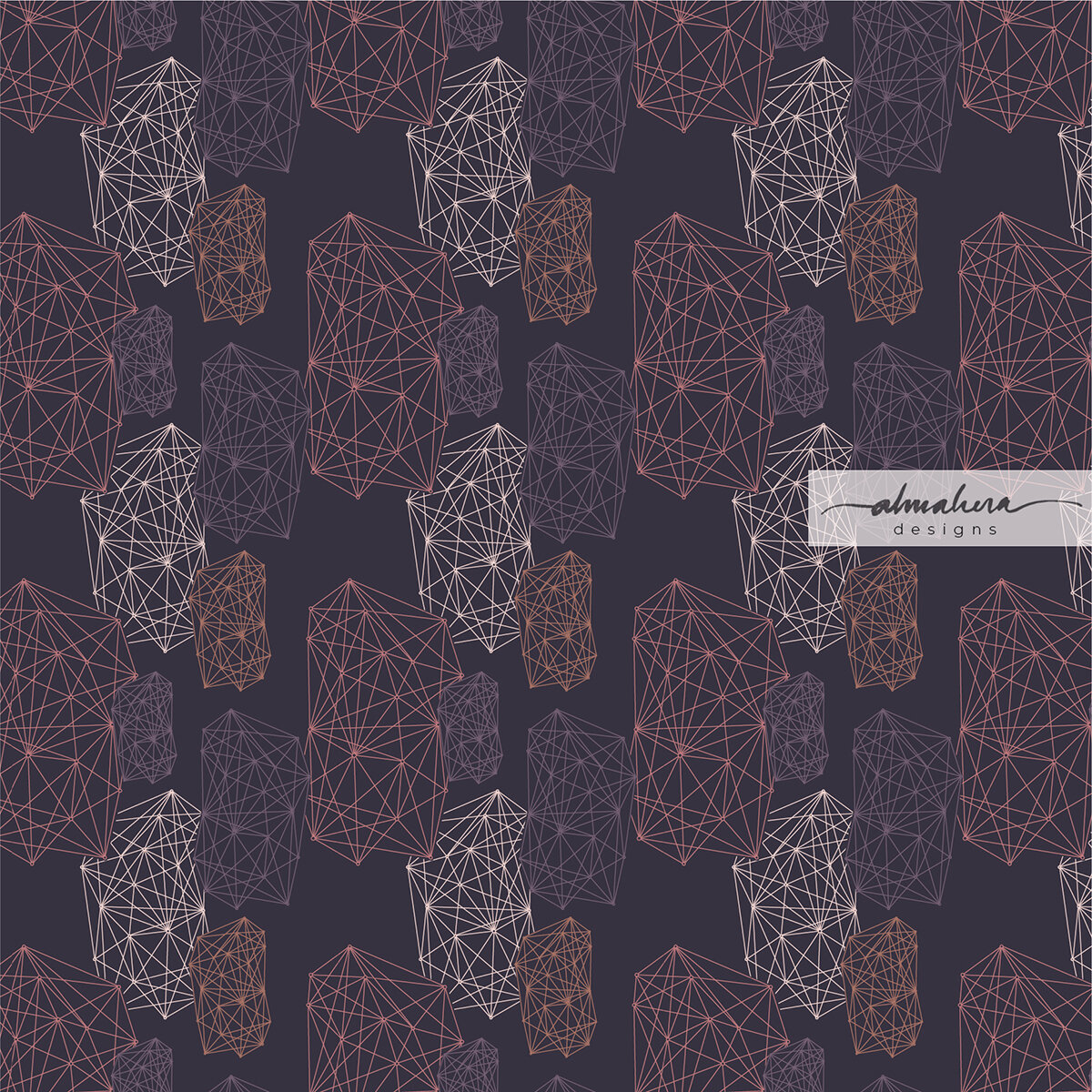
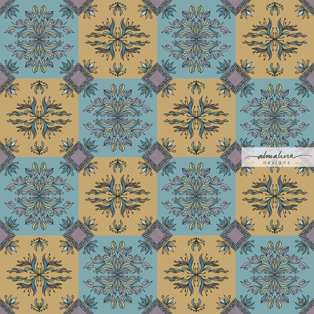
Some days I had a very clear idea of how I wanted my pattern to look like, and I managed to achieve it (Day 1: “Houses” and Day 30: “Dance”). Other days, I knew exactly what I wanted to sketch, or what I was inspired by, but absolutely no idea where I was going with it. I would play around with the motifs until something clicked (Day 6: “Strings” and Day 15: “Anyam”). Then there were days when try as I might, I just couldn’t translate the vision I had in my mind to the end design (Day 2: “Ombak” and Day 17: “Bougainvillae”). The best and most rewarding instance however, was when one source of inspiration led to several designs. Towards the end of the month, I was inspired by a metal filigree art piece I’d seen hanging on a wall in a hotel. I started doodling filigree patterns, and this resulted in not one, but five consecutive tiled filigree designs, each one “evolving” into the next iteration. (Day 26: “Filigree”, Day 27: “Tiles”, Day 28: “Spring”, Day 29: “Kerawang”, and Day 30: “Dance”). I’d seemingly entered into a filigree/kerawang phase of sorts; one I would happily revisit.

Beginner’s Luck? My very first pattern of the challenge, “Houses” turned out just as I had envisioned it. It took until the very last day of the challenge for this to happen again.

Beginner’s Luck? My very first pattern of the challenge, “Houses” turned out just as I had envisioned it. It took until the very last day of the challenge for this to happen again.

I hit a stumbling block on the second day; this was not the pattern I had in mind. I wasn’t happy with it, but I posted it anyway.

I hit a stumbling block on the second day; this was not the pattern I had in mind. I wasn’t happy with it, but I posted it anyway.

3. Inspiration is everywhere.

Daily deadlines meant that I didn’t have the time to “look for inspiration”. I needed to use whatever I had at the time, and it could come from anywhere. It could be something I’d read (Day 1: “Houses” and Day 13: “Crossword”), or a song I’d been listening to (Day 3: “Better In Colour”). It could come from experiences (Day 2: “Ombak” and Day 4: “Hippity Hop”), or from random things I notice in places I happen to be at (Day 6: “Strings”, Day 16: “SevenEight Lay Them Straight”, and Day 24: “Cozy”). There was a day where I “cheated”, and browsed through my old sketchbooks to look for old sketches that I could use (Day 21: “EllieFunt”).

There were days when I wasn’t inspired by anything specific, but I just felt like making marks on paper, or doodling lines and shapes (Day 7: “Kusut” and Day 10: “Check Check Chequer”).

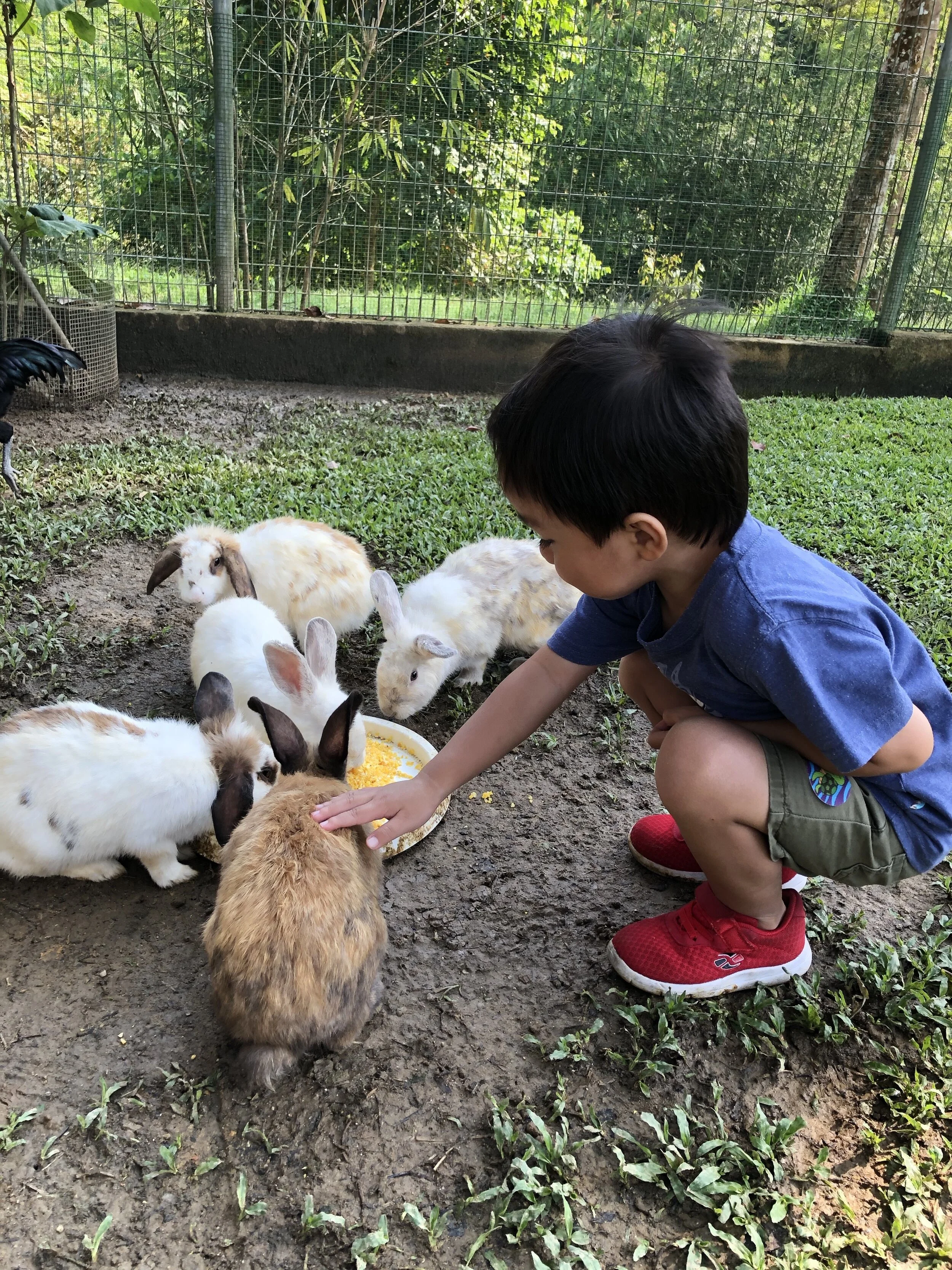
This scene inspired Day 4: “Hippity Hop”.

This scene inspired Day 4: “Hippity Hop”.

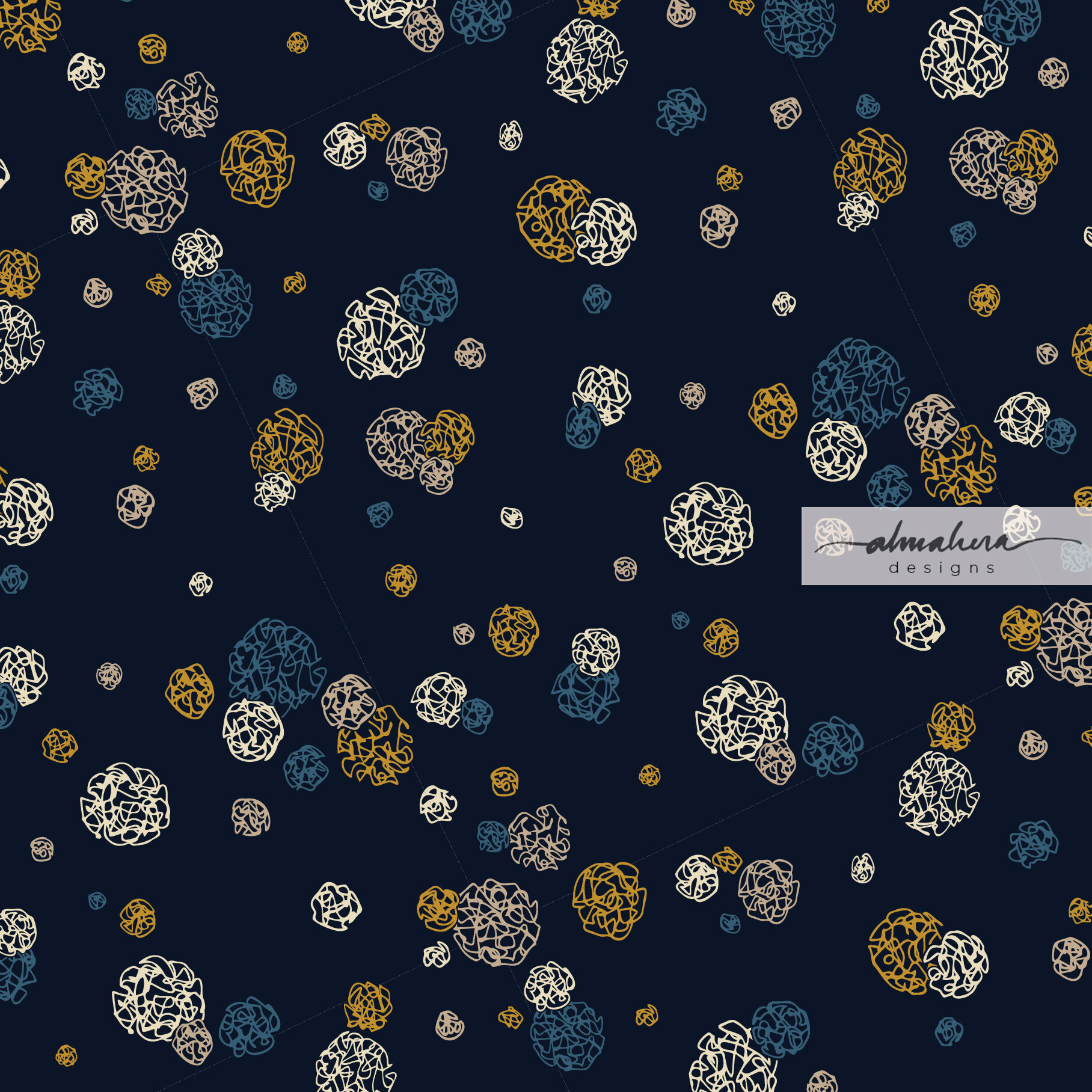
Day 7: “Kusut”. This wasn’t inspired by anything in particular; I just felt like doodling circles and lines.

Day 7: “Kusut”. This wasn’t inspired by anything in particular; I just felt like doodling circles and lines.

4. Every pattern has a story.

Each time I posted a pattern on my Instagram account, I tried to write something about it; usually what inspired it, or something about the design process. I learnt that having a story - and sharing it - made a design more interesting (to me, at least). It gives meaning to what I create, and to those who view it.

5. Developing a personal style requires more practice.

I knew that I would have to create far more than 30 patterns for a personal style to emerge, but I was still hoping that I could see a modicum of identity peeking through. That hasn’t happened yet, as far as I can see, and that’s fine. It just means I need to design more and more patterns, and I see nothing wrong with that.

So what’s next?

Will I attempt another #30DayChallenge, or something similar? I thoroughly enjoyed the excercise, so I think I will, but perhaps not too soon. For now I need to do some housekeeping (hello, 196 unread emails!), and work on some other areas I’d like to improve. I’ll slowly put the patterns up on products in my Society6 shop, and I’m planning to make some available as free downloadable wallpaper/screensavers. So watch out for that!

If you followed me on my #30DayChallenge, thank you! I hope you enjoyed my patterns. If you have any favourites, do let me know. It’d be nice to see what everyone’s opinions and tastes are like.

If you haven’t seen it yet and your curiosity is piqued, all 30 patterns are on my Instagram page, @almaheradesigns. Or you can click on the link at the top of my site. Do let me know what you think.

Until next time, toodles!

-A-


Transition

I love autumn; it’s my favourite season of the year. I love everything about it: the cool, crisp air; the smell of apple and cinnamon and cloves that gently surrounds you as you browse through the markets; and the colours.

The gorgeous, gorgeous, colours. The reds, the golds, the deep, burnt oranges… so rich and warm and stunning.

Did I mention I love the colours of autumn?

Living on the equator, though, means that the only seasons we get are hot and balmy, hot and hazy, and tropical thunderstorms with a dash of flash floods. Which means I need to live vicariously through my watercolours.

Transition_1_1800px.jpg

Transition I

Transition_2_1800px.jpg

Transition II

Like a lot of the stuff I’ve been doing lately, these pieces started out as watercolour doodles (I was actually doodling mimosa flowers and leaves for another piece). As usual, I then digitised the doodles and continued working on it in Procreate. I played around with different colours and hues, and added some inky details.

To be honest, I was initially trying to channel an Andy Warhol vibe when I was creating these pieces, but somewhere along the way I started thinking of the changing colours of leaves in autumn, and I decided to go with that instead.

Transition II is my personal favourite; and now that I look at it, the colours of Transition I remind me of a flag - I just can’t remember which country.

What do you see?

And which season’s your favourite?