Wallpaper Wednesday: Dokoh

Hi there! Hope you’re staying safe. If you’re fasting, I hope you’ve had a blessed Ramadhan so far. We have about a week to go, and I suppose some of you have started making MCO Raya preparations. All the best!

I wanted to make this month’s wallpaper Raya-appropriate, without resorting to the typical images of ketupat, pelita, or moonlit skies. Don’t get me wrong - I have absolutely nothing against a bunch of ketupat hanging in the upper corner of a poster, or glowing oil lamps set against a dark, moonlit sky; I just didn’t feel like creating a pattern using those motifs.

And yes, I go through moods. Sometimes I feel like playing with watercolours. I love going through my paints and picking them out, experimenting with different brushes, and just watching the colours mix together on paper. I appreciate giving up control over the way the paints move, and letting them do their own thing. In some cases, I add details and highlights in India ink, or white acrylic ink, and when I’m feeling blingy, I add metallic gold ink details.

I even enjoy the steps after I’m done painting, ie scanning, cleaning up, and editing the artwork in Photoshop. There is a part of me that finds certain repetitive and/or operational tasks almost therapeutic. If I had to choose a household chore to do, it would be ironing. I could zone out while listening to a podcast or an audiobook. Similarly with editing digital scans of my artwork, I would zone out while zooming right into all the details, isolating the paper background, and tweaking the contrast and saturation to just the right level, with something playing in the background. And maybe a sweet smelling candle burning.

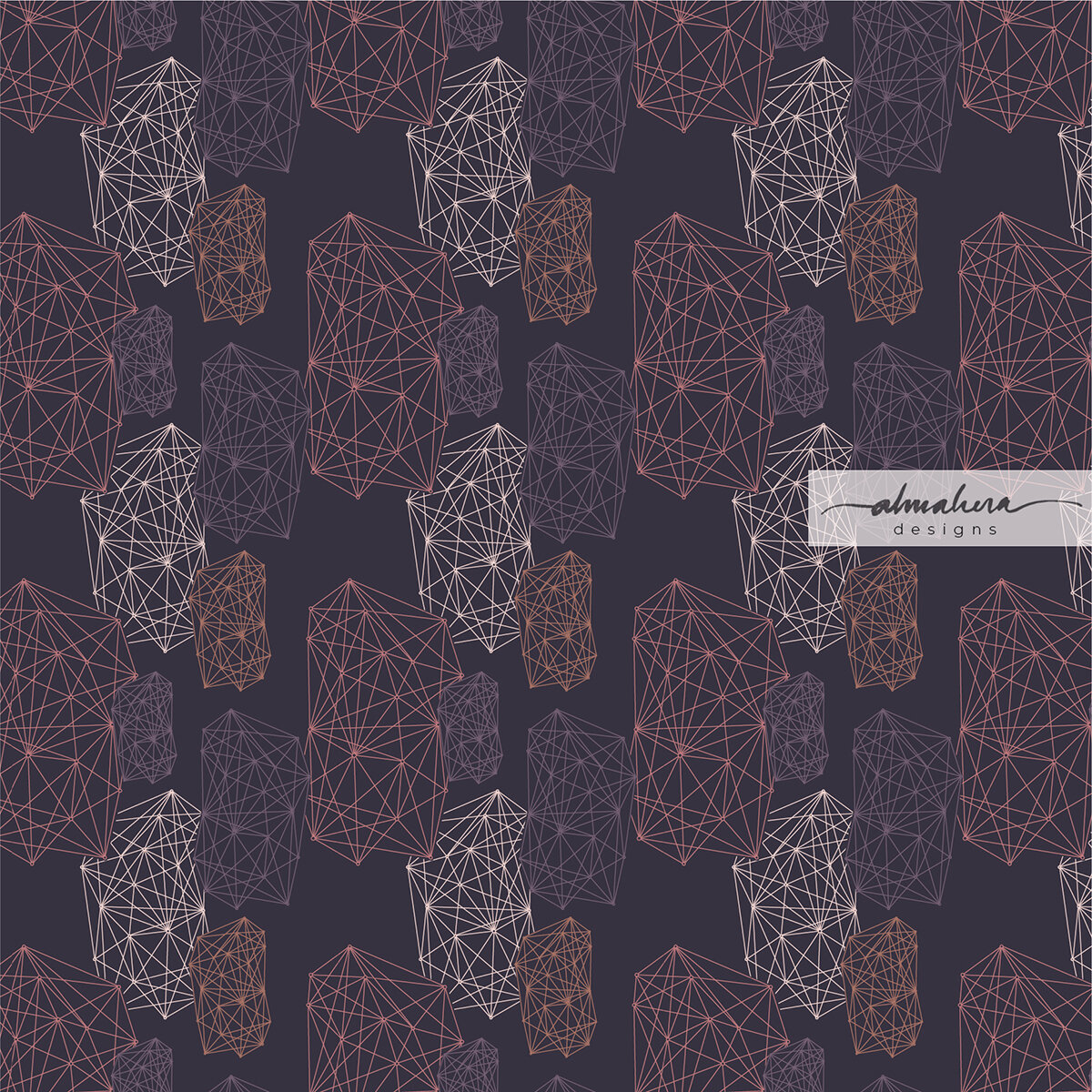
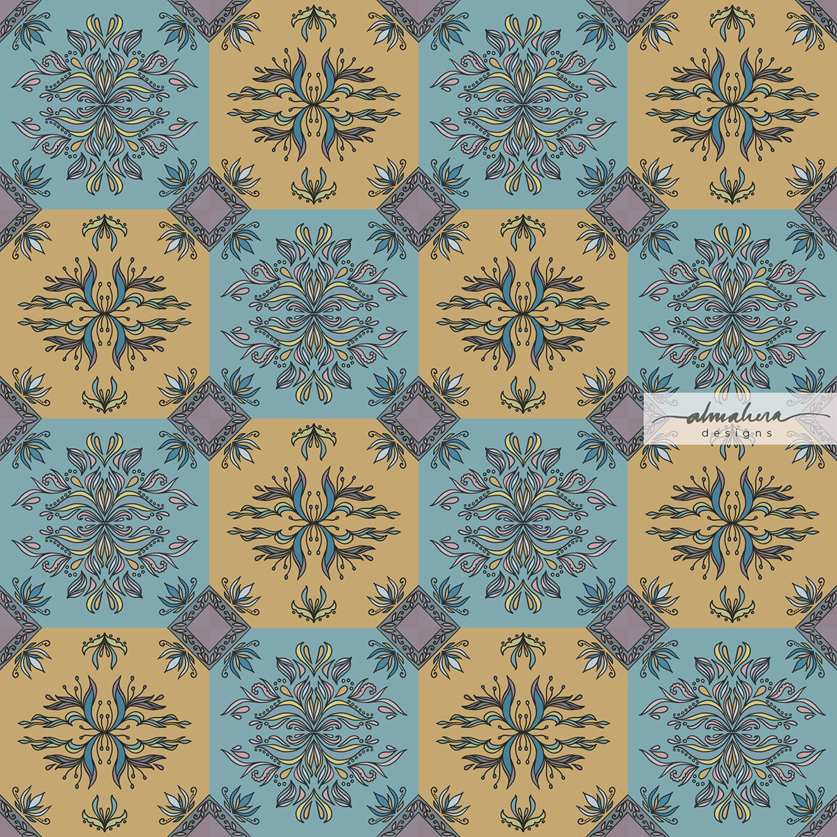
Sometimes I still feel like creating pattern motifs on paper, but I want to use Illustrator instead of Photoshop in the editing and pattern making steps. So then I wouldn’t paint, but I’d sketch (to the best of my ability) or doodle in ink. I’d choose colour palettes from images I see in magazines or things around me, import them into Illustrator, and click click Pen Tool Blob Brush Space Bar Command, I’m in the zone.

And then there are times when I just want to do it all digitally. No paint, no paper, no brush pen pencil nothing. Just my Procreate and me, doodling away with a tap tap erase and pinch pinch zoom.

By the way, I have a four-and-a-half-year old toddler who spends every waking hour talk talk talking, plus our neighbours are undertaking a massive renovation on their home, and it’s been seven months (so far) of wrecking knocking piling hammering drilling…. so if you notice a certain pattern in my writing, I hope you’ll understand why.

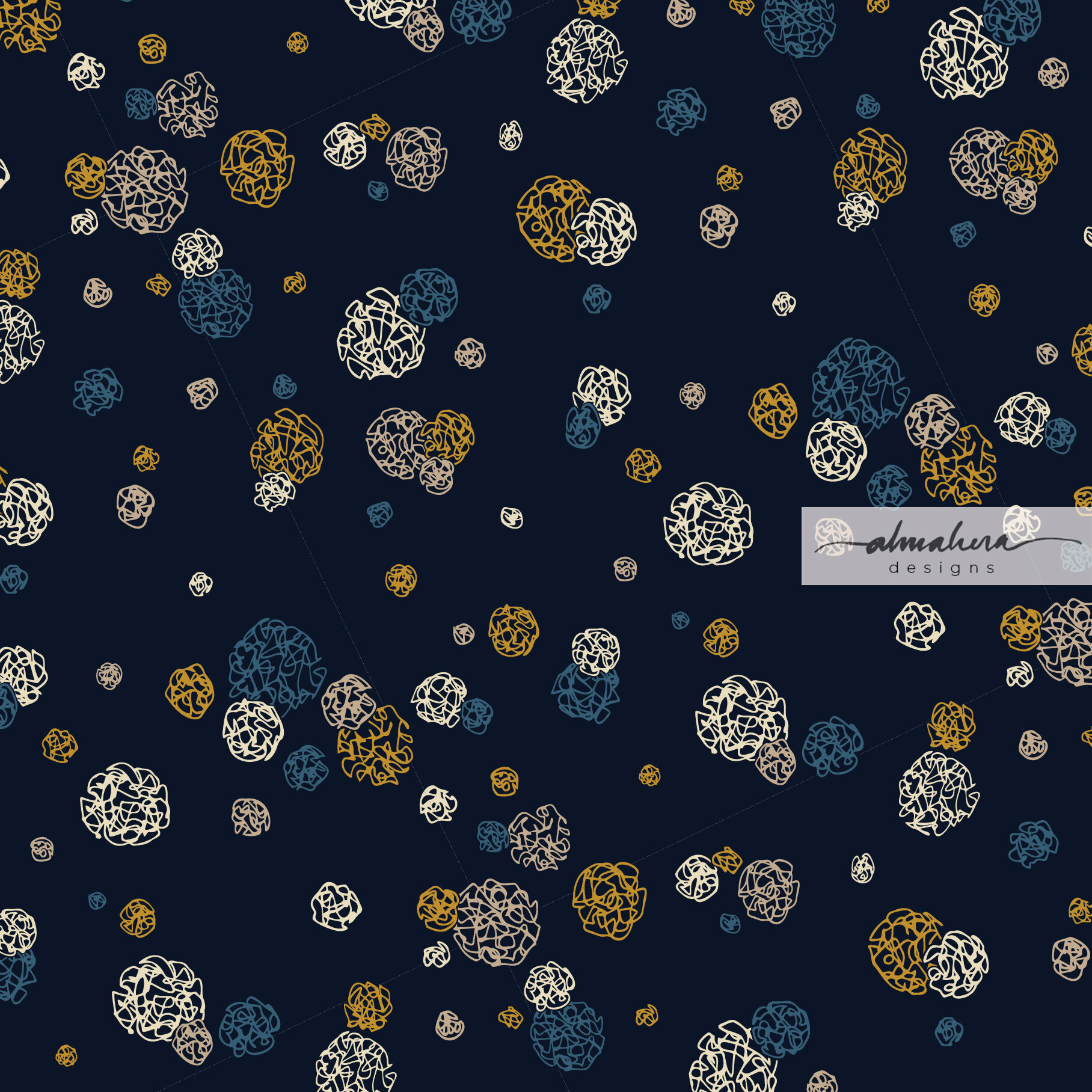
So anyways, back to Procreate and digital art - this month’s pattern is precisely that; one which I created and edited on my iPad, using watercolour “brushes” which mimic the real thing. I was inspired by the dokoh - the traditional accessory worn with the kebaya or baju kurung. They’re usually worn in sets of twos or threes, and can usually be worn either as brooches or a necklace. It is equally as stunning when worn alone, as some do.

The dokoh.

The dokoh.

I quite like this one.

I quite like this one.

I love the intricate metalwork in the dokoh, and I started thinking how I could translate it into a pattern. So I doodled away, came up with a few I quite liked, and chose this one for this month’s freebie.

Dokoh_iPhone.jpg

I hope you like it as much as I do, and I hope that it brightens up your day, even if for a fraction of a second. In the current world we live in, we try and find warmth in the tiniest sliver of sunshine.

You’ll find the links below. As always, these files are for personal use only.

Enjoy!

-A-


Dokoh

Mobile: iPhone // Android

iPad: Pro 11” // Pro 12.9” // Others

Laptop: MacBook Pro 13” // MacBook Pro 13” with calendar // MacBook Pro 15” // MacBook Pro 15” with calendar

Desktop: iMac 27” // iMac 27” with calendar 

The #30DayChallenge

Helloooooo there! Long time no write! We’re a month into the new year… how has 2020 treated you so far? I know we’ve had quite a bit of sad and scary news in the past few weeks, but I hope that at the same time you’ve had some positive starts - or at the very least, something exciting and wonderful to look forward to at some point in this year.

Like a lot of other people, I approached 2020 with a list of goals for myself. It’s a pretty short list - I’m trying to be realistic - and one of my goals is to have a portfolio of pattern designs by the end of the year. If not a complete portfolio, at least one pattern collection (ie 8-12 patterns designed around a central theme). I would have to choose the ones I feel are my best designs, and to do that, I’d have to design many, many patterns (at least a hundred). Which means this year will be a year for me to practise, practise, practise.

That was when, just a few days before the start of the year, I set myself a challenge: to design one repeat pattern a day, every day, in the month of January, and post it on Instagram. The #30DayChallenge. Yes, January has 31 days, but I thought a nice round number like 30 would look and sound nicer, and I could give myself a day off on the 31st.

Why did I do it?

I wanted to do the challenge to force myself to practise regularly, and I was hoping that the daily deadlines would instil some form of discipline and establish an efficient workflow in my day-to-day routine. I also wanted all 30 patterns to be seamless repeat patterns, as I wanted to train myself to use Illustrator (and other tools) quickly and efficiently.

So how did I fare?

Well firstly, I managed to complete all 30 days (yayyy!). I honestly thought that I would end up skipping a few days, perhaps due to sick days, toddler/family emergencies, and the most likely hurdle: general laziness. Thankfully life was kind and didn’t throw me any curveballs, and I managed to keep my lazy bones in check.

The more important question is, what did I learn from this exercise?

1. Don’t overthink it. Just do.

I realised very early in the challenge that whenever I have even an inkling of an idea, I shouldn’t mull over it for too long. Just run with it. It doesn’t matter that the idea may not yet be fully developed; just start sketching. The pattern will develop along the way. It will take form as I’m sketching out the motifs, and more so after I digitise the sketch and work on it in Illustrator (or Photoshop, or Procreate). Sometimes the sketch won’t turn out the way I imagined it would (I’m looking at you, goat-rabbit-donkey monstrosity in Day 4:“Hippity Hop”), but go along with it anyway. In the context of this exercise, it’s the process that matters.

Day 4: “Hippity Hop”. The dark grey goat-rabbit-donkey is staring straight at me, accusingly.

Day 4: “Hippity Hop”. The dark grey goat-rabbit-donkey is staring straight at me, accusingly.

2. Ideas will morph and evolve.

Some days I had a very clear idea of how I wanted my pattern to look like, and I managed to achieve it (Day 1: “Houses” and Day 30: “Dance”). Other days, I knew exactly what I wanted to sketch, or what I was inspired by, but absolutely no idea where I was going with it. I would play around with the motifs until something clicked (Day 6: “Strings” and Day 15: “Anyam”). Then there were days when try as I might, I just couldn’t translate the vision I had in my mind to the end design (Day 2: “Ombak” and Day 17: “Bougainvillae”). The best and most rewarding instance however, was when one source of inspiration led to several designs. Towards the end of the month, I was inspired by a metal filigree art piece I’d seen hanging on a wall in a hotel. I started doodling filigree patterns, and this resulted in not one, but five consecutive tiled filigree designs, each one “evolving” into the next iteration. (Day 26: “Filigree”, Day 27: “Tiles”, Day 28: “Spring”, Day 29: “Kerawang”, and Day 30: “Dance”). I’d seemingly entered into a filigree/kerawang phase of sorts; one I would happily revisit.

Beginner’s Luck? My very first pattern of the challenge, “Houses” turned out just as I had envisioned it. It took until the very last day of the challenge for this to happen again.

Beginner’s Luck? My very first pattern of the challenge, “Houses” turned out just as I had envisioned it. It took until the very last day of the challenge for this to happen again.

I hit a stumbling block on the second day; this was not the pattern I had in mind. I wasn’t happy with it, but I posted it anyway.

I hit a stumbling block on the second day; this was not the pattern I had in mind. I wasn’t happy with it, but I posted it anyway.

3. Inspiration is everywhere.

Daily deadlines meant that I didn’t have the time to “look for inspiration”. I needed to use whatever I had at the time, and it could come from anywhere. It could be something I’d read (Day 1: “Houses” and Day 13: “Crossword”), or a song I’d been listening to (Day 3: “Better In Colour”). It could come from experiences (Day 2: “Ombak” and Day 4: “Hippity Hop”), or from random things I notice in places I happen to be at (Day 6: “Strings”, Day 16: “SevenEight Lay Them Straight”, and Day 24: “Cozy”). There was a day where I “cheated”, and browsed through my old sketchbooks to look for old sketches that I could use (Day 21: “EllieFunt”).

There were days when I wasn’t inspired by anything specific, but I just felt like making marks on paper, or doodling lines and shapes (Day 7: “Kusut” and Day 10: “Check Check Chequer”).

This scene inspired Day 4: “Hippity Hop”.

This scene inspired Day 4: “Hippity Hop”.

Day 7: “Kusut”. This wasn’t inspired by anything in particular; I just felt like doodling circles and lines.

Day 7: “Kusut”. This wasn’t inspired by anything in particular; I just felt like doodling circles and lines.

4. Every pattern has a story.

Each time I posted a pattern on my Instagram account, I tried to write something about it; usually what inspired it, or something about the design process. I learnt that having a story - and sharing it - made a design more interesting (to me, at least). It gives meaning to what I create, and to those who view it.

5. Developing a personal style requires more practice.

I knew that I would have to create far more than 30 patterns for a personal style to emerge, but I was still hoping that I could see a modicum of identity peeking through. That hasn’t happened yet, as far as I can see, and that’s fine. It just means I need to design more and more patterns, and I see nothing wrong with that.

So what’s next?

Will I attempt another #30DayChallenge, or something similar? I thoroughly enjoyed the excercise, so I think I will, but perhaps not too soon. For now I need to do some housekeeping (hello, 196 unread emails!), and work on some other areas I’d like to improve. I’ll slowly put the patterns up on products in my Society6 shop, and I’m planning to make some available as free downloadable wallpaper/screensavers. So watch out for that!

If you followed me on my #30DayChallenge, thank you! I hope you enjoyed my patterns. If you have any favourites, do let me know. It’d be nice to see what everyone’s opinions and tastes are like.

If you haven’t seen it yet and your curiosity is piqued, all 30 patterns are on my Instagram page, @almaheradesigns. Or you can click on the link at the top of my site. Do let me know what you think.

Until next time, toodles!

-A-


Transition

I love autumn; it’s my favourite season of the year. I love everything about it: the cool, crisp air; the smell of apple and cinnamon and cloves that gently surrounds you as you browse through the markets; and the colours.

The gorgeous, gorgeous, colours. The reds, the golds, the deep, burnt oranges… so rich and warm and stunning.

Did I mention I love the colours of autumn?

Living on the equator, though, means that the only seasons we get are hot and balmy, hot and hazy, and tropical thunderstorms with a dash of flash floods. Which means I need to live vicariously through my watercolours.

Transition_1_1800px.jpg

Transition I

Transition_2_1800px.jpg

Transition II

Like a lot of the stuff I’ve been doing lately, these pieces started out as watercolour doodles (I was actually doodling mimosa flowers and leaves for another piece). As usual, I then digitised the doodles and continued working on it in Procreate. I played around with different colours and hues, and added some inky details.

To be honest, I was initially trying to channel an Andy Warhol vibe when I was creating these pieces, but somewhere along the way I started thinking of the changing colours of leaves in autumn, and I decided to go with that instead.

Transition II is my personal favourite; and now that I look at it, the colours of Transition I remind me of a flag - I just can’t remember which country.

What do you see?

And which season’s your favourite?

Watercolour Doodles: Urban Living

I’d gotten my hands on some new paints, and was swatching all the colours for reference. I had some leftover in my palette, and I didn’t want to waste any of it, so this happened:

Original Doodle_1800.jpg

The Doodle

It looked like a bunch of high rise apartments to me, so I digitised it and added some details. I like the look of watercolour and ink; I think - especially with more loose or abstract watercolour pieces - it lends a playful, illustrative, vibe. So in Procreate, I played around with some “inky” details:

Urban Living_1800.jpg

Urban Living

I also wanted to try another style, so I eschewed the ink outlines, added some shading to give the shapes some depth, and then had fun with splatters:

Urban Living2_1800.jpg

Urban Living 2

I can’t make up my mind which one I like better; some days I prefer one, some days I prefer the other.

Which one do YOU like, and what do they look like to you?