
It’s time for new wallpaper! 😄
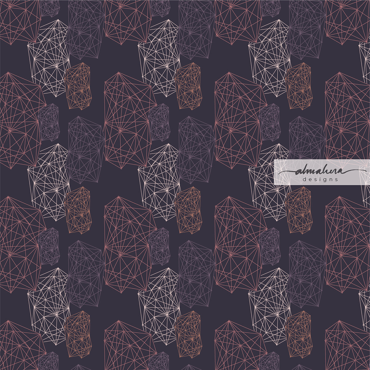
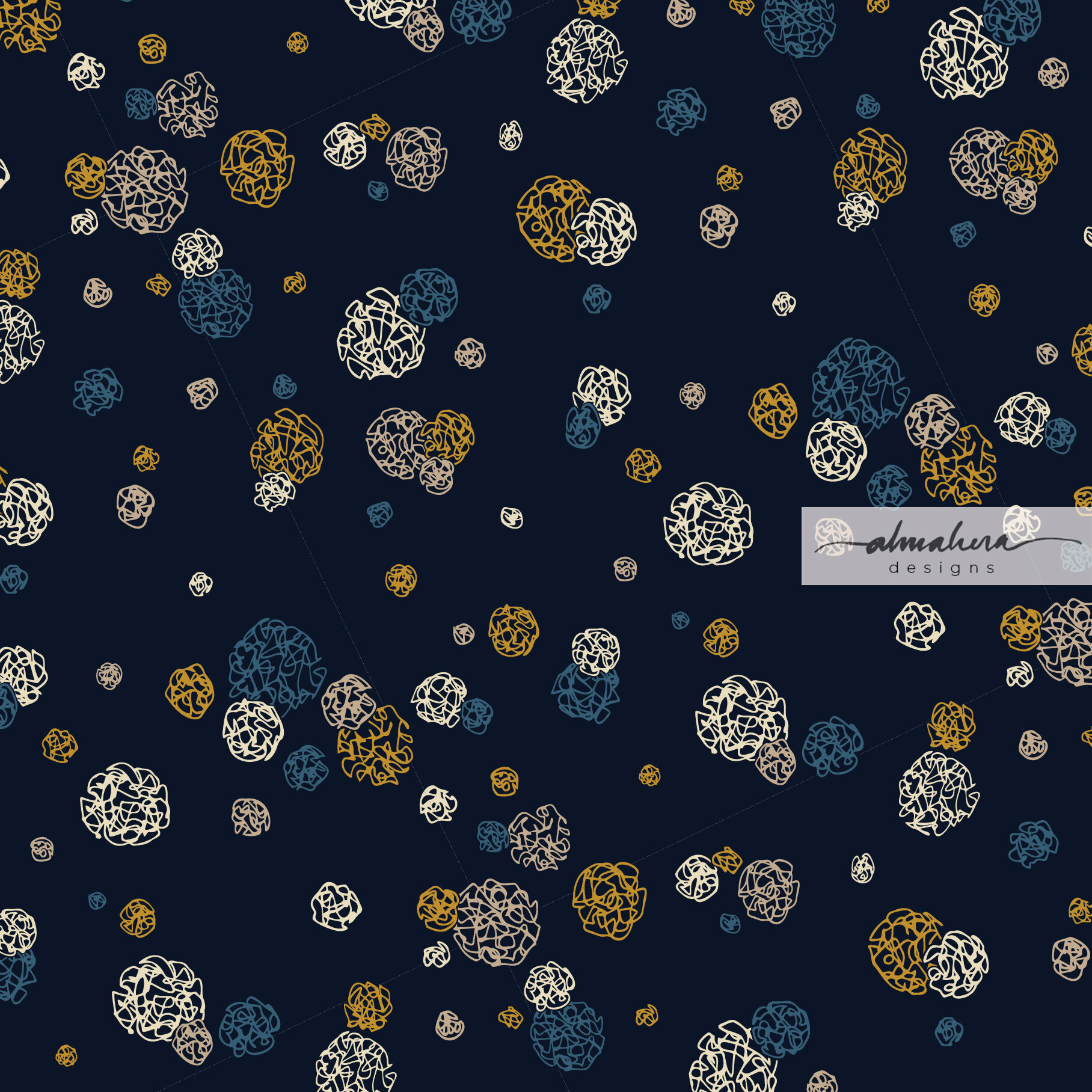
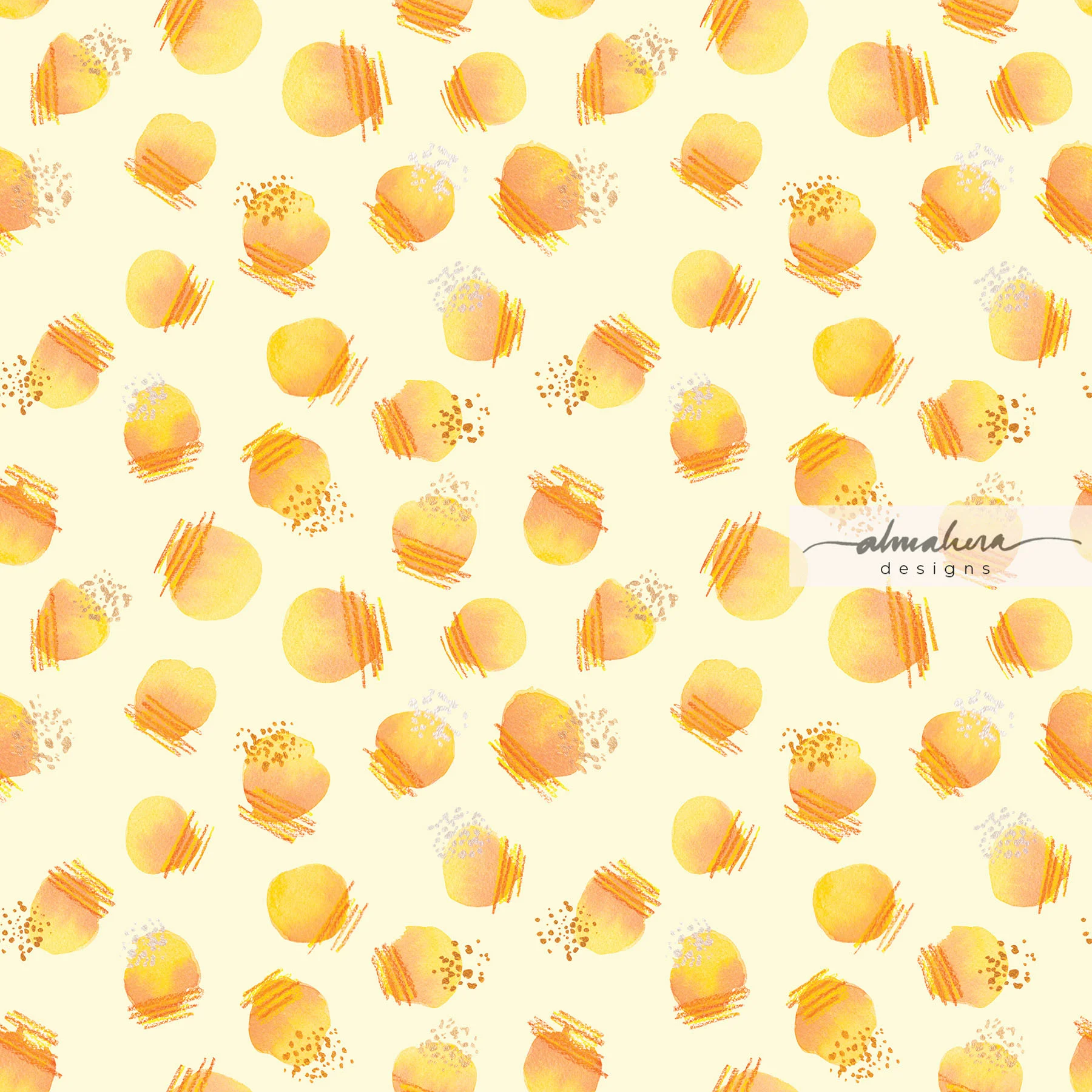
This month, I chose one of my favourites from a collection of geometric patterns I designed a few weeks ago. I’d just finished a Skillshare tutorial on creating geometric patterns on Procreate and boy, was I hooked! Designing geometric patterns can be addictive - playing with shapes and different permuations, different colour combinations - I was creating one pattern after another for days on end until it got a bit too much… random patterns were popping up in my mind’s eye as I drifted off to sleep, or first thing in the morning, and even in the shower!

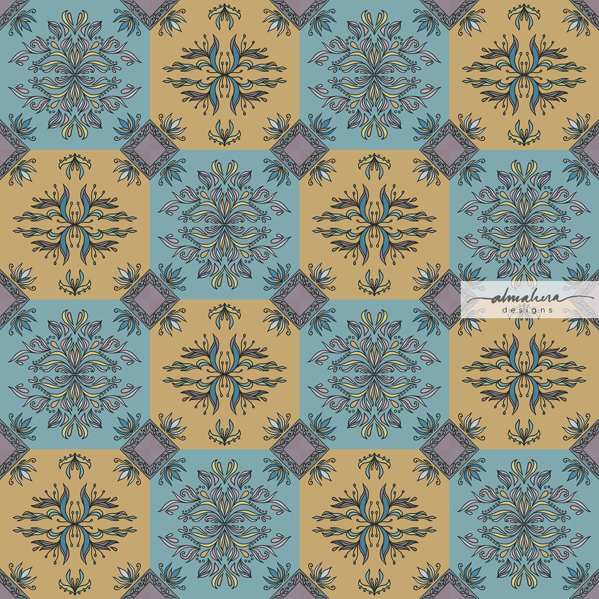
Scallops 2. Check out the texture on this!

This particular pattern has a bit of an Art Deco/1950’s hybrid feel to it, in my personal opinion. The motif in this pattern is one commonly found in many Art Deco or Art Deco-inspired patterns, and in my case it was totally unintentional. I was just playing around with circles; cropping, flipping, and arranging them in a tile. The colour palette, however, is what gives it its ‘50s/’60s vibe, and that was intentional - if not fully, then at least at a subconscious level. At the time I started getting into geometric patterns, I’d just finished binge-watching The Queen’s Gambit on Netflix (late to the party as always).
I was transfixed.
Apart from the brilliant storyline and performance by the cast, I simply loved the aesthetic. The fashion of that era - the silhouettes, the hairstyles, the colour palette… and the patterns. Glorious, beautiful geometric patterns everywhere. The wallpaper, the textiles, the upholstery - everything. It was a feast for the eyes and I absolutely loved it.
Huh. Thinking back, maybe I started creating geometric patterns because of The Queen’s Gambit. It inspired me to search for geometric pattern tutorials instead of kindling a love for chess 🤓.
In any case, I hope you like this month’s freebie wallpaper. I had a lot of fun creating it, and I think it’ll give your devices a nice retro vibe.
-A-
*As always, these are for personal use only.
Scallops 2
iPad: Pro 11” // Pro 12.9” // Others
Laptop: MacBook Pro 13” // MacBook Pro 13” with calendar // MacBook Pro 15” // MacBook Pro 15” with calendar
Desktop: iMac 27” // iMac 27” with calendar


